This article may contain outdated material
This article may reference outdated material related to the legacy version of GTmetrix.
We’re excited to finally release the version 2 update to GTmetrix!
This redesign was driven by user feedback and responses from thousands of participants in our survey. Read on to see what we’ve done:
New Design
Updating the look of GTmetrix was the main focus of this update. Our original site design had a width of 960px – now we’ve increased the width of our layout to take advantage of the wider displays available.
Modern, flatter design
We’ve flattened things out and focused on a cleaner look. In addition, we’ve added some visual icons to help with feature and option recognition.
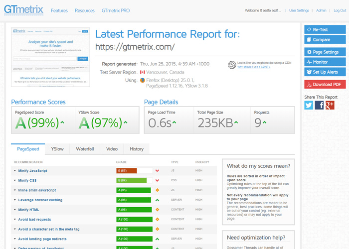
Colors are brightened and high contrast buttons emphasize important actions.
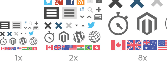
SVG
All our icons and graphics have been converted to SVG, ensuring great looking visuals at any size.
Responsive
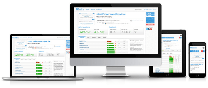
GTmetrix is now fully responsive! This was quite difficult given all the data GTmetrix generates, but we managed to deliver the core functionality of GTmetrix even at smaller screen sizes. We focused on fluid design as well, maximizing the use of screen real estate as much as possible.
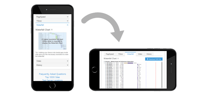
Some data and functionality will be limited at the reduced display sizes. Features like History graphs, Waterfall graphs and others simply won’t be functional at a small screen size, so either switch your device to landscape mode or have a look at the report on a full desktop screen.
Reorganization
At the focal point of this redesign was the Report Page – it’s the most viewed page aside from the Home page. Here are some highlights on the work we did:
Action Section
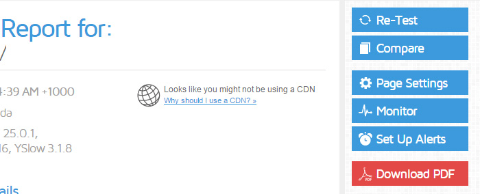
We moved a few features and common actions into their own dedicated sections for higher visibility.
In our survey, we discovered that a lot of our users were unaware of the additional features GTmetrix had to offer, so we took them out of the general “Page Settings” screen and gave them their own space.
You’ll see new buttons for:
- Monitor
- Set Up Alerts
- Compare (Combines URL and Region comparison)
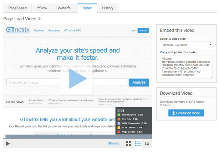
We also did some reorganization on the Report Page tabs:
- Added “Video” tab – Gave video playbacks their own home to increase visibility of the feature
- Changed “Timeline” to “Waterfall” – More conventional name
Sidebar Menu
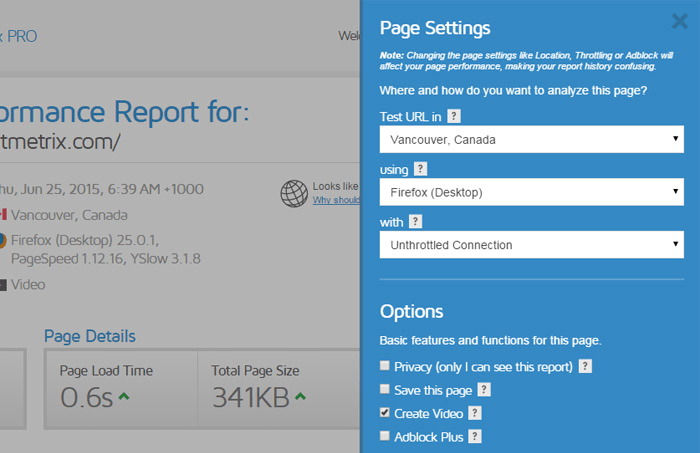
We switched from lightboxes to a sliding sidedrawer for all Page Settings and options. This change will make navigating settings and options a lot more streamlined – especially down to mobile device sizes.
New Features and updates
GTmetrix version 2 is primarily a visual update, however we were able to implement some new features and updates to make GTmetrix more usable.
Filter Widget
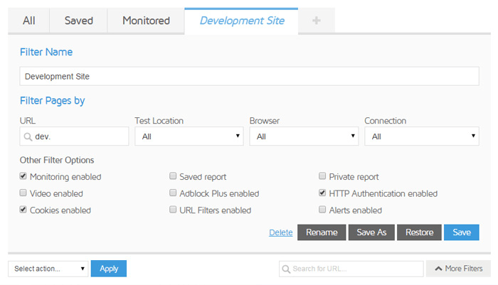
Now you can easily find your reports with filters and instant search. We’ve also added sorting, paging and “Show Amount” options to help accounts with numerous reports (30+) find what they need more efficiently.
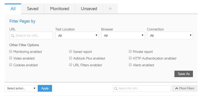
This new filter functionality also lets you create custom search filters. Use keywords and/or options to define the reports you want ot see, then save the filters into their own tab. You’ll readily have your filters available for faster reference.
Improved Report PDF
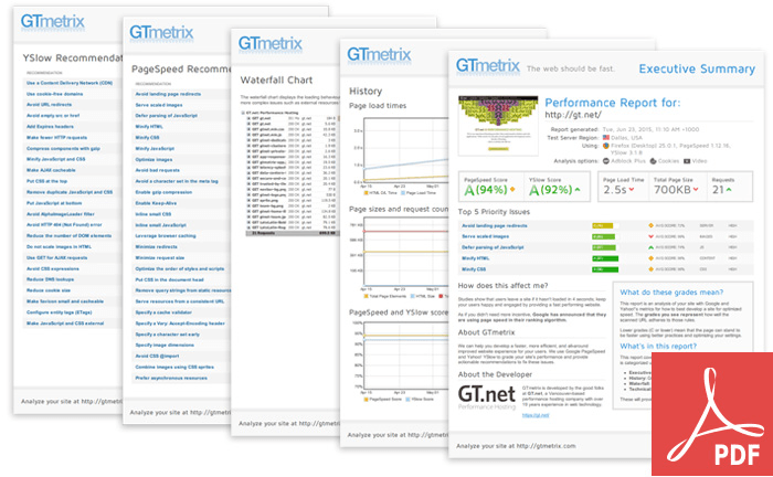
We’ve made some general improvements to our PDF reports, including updating the look and feel to the new GTmetrix version 2 design, and implementing better logo handling for our white-label GTmetrix PRO users (better scaling, transparency enabled).
SSL for everything
To ensure the security of our users we’ve pushed everything to SSL.
Give GTmetrix version 2.0 a try today!
We’ve put a lot of work into making GTmetrix better and with your feedback, we hope this iteration makes optimizing your websites easier and more efficient!
Let us know if you run across any bugs or issues and feel free to tell us your thoughts on twitter (@gtmetrix) or contact us.


