This article may contain outdated material
The features outlined in this article are still available. However, the content pertains to the legacy version of GTmetrix.
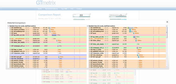
Today, we’re happy to announce HAR Diff, an add-on we wrote for HAR Viewer to allow the comparison of 2 waterfall graphs side-by-side!
GTmetrix uses Jan Odvarko’s HAR Viewer to give our users a way to visualize page loads via elegant waterfall graphs.
Compare two sites and try it for yourself or take a look at our sample comparison comparing Slashdotfrom our Vancouver, Canada and Sydney, Australia test regions.
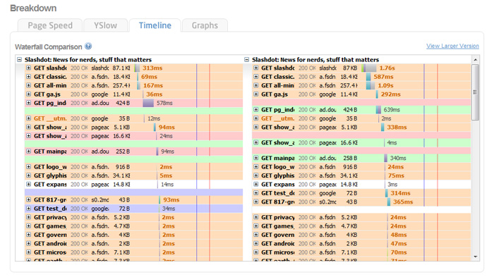
Differences in loading elements are classified by colours:
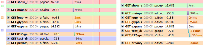
Color key:
- White: The resource status, size, or timings haven’t changed significantly (small timing changes are ignored).
- Orange: The resource status, size, or timings have changed. Bolded orange text indiciates what has changed.
- Green: The resource was added in the second waterfall.
- Red: The resource was missing in the second waterfall.
- Blue: The resource is present in both waterfalls, but was loaded in a different order.
You can enlarge the HAR Diff by clicking on “View Larger Version”, or open it in a new window to view the waterfalls in a full window.
We have submitted some patches to the HAR Viewer project (which have already been accepted) and will be releasing the rest of the HAR Diff code soon, so you can also add HAR Diffs to your project!