This article may contain outdated material
This article may reference outdated material related to the legacy version of GTmetrix.
In this round of updates, we’ve added 2 major features to GTmetrix and fixed some bugs.
Complete History Viewing
Previously, you could only view the last 30 days of your reports in the “History” tab. We’ve now made it so you can view your entire report history. Some new UI elements are added to facilitate that process:

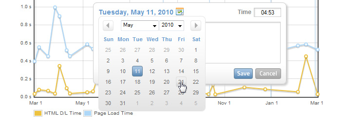
This is the date range selector. Click on the calendar to select the start date and end date of your range, and the graphs will regenerate to display all the reports within that range.
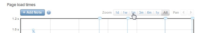
This is the zoom panel. You can select how close you would like to see your range of reports. From 1 day, to 1 year, to All. When zoomed in, you are also able to pan left and right using the arrows.
Another way to zoom is to click and drag a range on your graph. You’ll zoom in on your defined range; use the Pan arrows to move left and right.
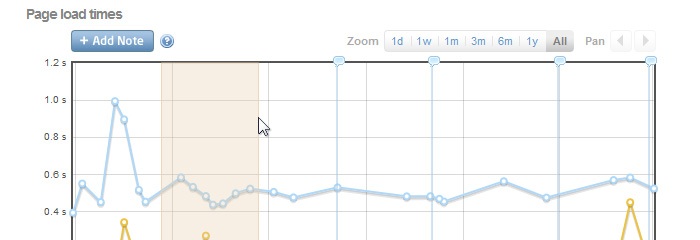
Averaged graph points
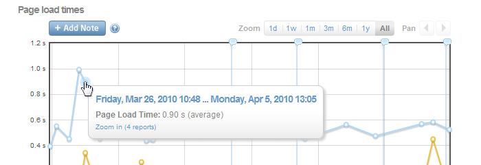
When there are several reports in close proximity within a range, they are averaged into a single point. You can zoom into that range by clicking on the “Zoom in” option in the tooltip.
Annotations
You can now add notes and comments on your graph to help track changes.
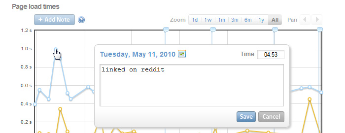
In the History tab, click on the “Add Note” button, then move the cursor over the graph. You’ll notice the pointer replaced with a crosshair. Click where you want to add the note. After a note has been added, it is indicated at the top of the graph with a speech bubble and a vertical blue line.
Bug Fixes
- Report data points are now aligned vertically across graphs
- Report times displayed on tooltip now correspond to the reports