

Mobile performance testing should be an essential part of your website maintenance checks.
Overview
Mobile engagement is at an all-time high and everyone knows that optimizing mobile performance is essential these days.
However, mobile optimizations are often overlooked, in favour of easier desktop optimizations.
With Google shifting to a mobile-first approach, mobile testing is essential for any website owner in the pursuit of (what Google calls) a “delightful” user experience for all visitors.
GTmetrix offers mobile testing even on free accounts, while upgrading to PRO unlocks full access to 55+ devices and variants.
Continue reading to learn why mobile testing should be an essential part of your web performance strategy.
Mobile optimizations are essential
Over 50% of all internet usage these days comes from mobile devices.
If you didn’t already know, over half of the worldwide internet users access content through mobile devices these days.
Mobile engagement is also a pressing matter; take a look at these statistics on mobile behaviour:
- 30% of smartphone users are more likely to use a brand’s mobile website when browsing or shopping on a smartphone when making a one-time purchase.
- 50% of smartphone users are more likely to use a brand’s mobile website when browsing or shopping on a smartphone because they don’t want to download an app.
- 60% of smartphone users have contacted a business directly using the search results (e.g., “click to call” option).
Source: Think with Google
The importance of mobile usage is further emphasized by the fact that – in some countries, technological developments and lower pricing have led to many users skipping desktop technology entirely and predominantly using mobile devices to access the internet.
If you aren’t already optimizing your page for mobile users, you risk missing out on a large user base that accesses online content through their mobile devices, potentially limiting your online opportunities significantly.
Mobile experiences differ from Desktop experiences
Mobile experiences differ from those on desktop machines in a number of ways. We highlight a few key differences below:
Mobile hardware/connections are slower than desktops in general
While flagship mobile hardware and connections are approaching desktop speeds, not everyone has access to top-tier devices with the cutting-edge connections.
Depending on the region of your visitors, they could be using mid-range or lower-end devices with lower hardware specifications and slower connection speeds (LTE/3G).
Therefore, downloading, processing, and rendering the page would take longer on a mobile device compared to a desktop machine.
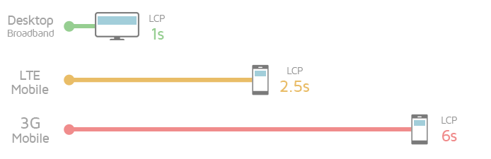
For example, a hero image that loads within 1 second (also known as Largest Contentful Paint) on a desktop page could take up to 6 seconds to load on a mobile device/connection.
Most users have a short attention span and if your page content takes too long to load, they could abandon it altogether and move on to another website.
Mobile designs are often afterthoughts
In many cases, websites are primarily designed for desktop audiences, which means they may end up containing a lot of media (images, video, etc.), styling, and other interactive content.
This creates higher bloat on a mobile device, which could result in a more sluggish mobile performance compared to a desktop machine, in turn, affecting page interactivity.
Moreover, if your page does not utilize adaptive design, or implement responsive design properly, then you’re likely serving mobile users a far larger payload than necessary.
HTTP Archive’s “State of the Web” research reveals that median page weight (including images, CSS, JavaScript) on mobile devices is quite close to that of desktop devices.
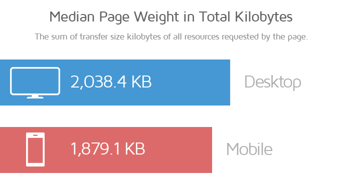
That means many webmasters are serving near-desktop levels of page content on smaller, lower performance devices.
Mobile pages are often less “delightful”
Since mobile devices have smaller viewports compared to desktops, your page content will load differently. This impacts the user experience – how users view and perceive your page content.
For example, ads, images, buttons, and other elements on the page can move around during the initial page load, making it harder for users to quickly find what they need.
In addition, constant shifting of layout and content makes user interaction unfriendly and frustrating, causing undesired taps and loading of content.
If there are many such “layout shifts“, it affects the way users interact with your webpage, and can ultimately annoy them.
Mobile testing has never been more relevant
A better mobile experience means more visibility and business opportunities, and is an important step towards a better web for all.
This belief is also echoed by Google, who are already prioritizing mobile performance in their search ranking algorithm in the following ways:
- Mobile-first Indexing
Google focuses on indexing mobile versions of pages over desktop, in their search ranking algorithm.
- Mobile-friendliness
Sites that are deemed mobile-friendly will be ranked higher in SERP.
- Mobile page speed
Since June 2018, mobile search rankings consider mobile page speed as an additional signal.
Web Vitals as a factor
Most recently, Google will start using Web Vitals as an additional signal in their search ranking algorithm, specifically applying it only to mobile search.
With so much emphasis on mobile page experience, anyone that’s serious about web performance can no longer afford to overlook mobile testing.
Note that while the above factors can contribute to better search rankings, exactly how much is unknown.
Content relevance still remains the most important factor you should focus on. A unique and highly relevant page with mediocre mobile performance will, in most cases, outrank a fast mobile page with poor content quality.
Summary
It is clear that online engagements are increasingly driven by mobile usage, and this is unlikely to change in the future.
A good mobile experience can, therefore be rewarding, not only for your visitors, but also for website owners through increased conversions and business opportunities.
With Google also echoing this belief, mobile testing should be an essential part of your website development and optimization workflow.
Sign up for a free GTmetrix account and give mobile testing a try!
Check out our guide on mobile testing with GTmetrix.
Test with mobile devices on a GTmetrix PRO plan

Mobile testing is available on all PRO plans, along with more test locations, Advanced Analysis Options and more.
You’ll also get Priority access for tests, More Monitored Slots, Hourly Monitoring (select plans only), Remote Location Monitoring (including Premium Test Locations), and more.