
Last Updated:
See how your site could display and load on over 55 different devices and variants
Overview
Your visitors may reach your website in a variety of different devices and screen resolutions.
GTmetrix allows you to test your page’s performance on them by modifying the screen resolution, user-agent and device pixel ratio to each device’s technical specifications.
Simulate Devices is available in limited form on Basic/Free accounts, and the complete list of 55+ devices can be unlocked by upgrading to a GTmetrix PRO plan.
What Does Simulate Device Do?
Simulate Device works by passing parameters to the GTmetrix browser to present itself as a specific device when it requests your website.
When your server receives this request, it treats GTmetrix as the device specified and delivers assets, layouts, etc intended for it.
Three parameters are changed in order for GTmetrix to simulate a device:
- Screen Resolution – An iPhone XR for example is 414×896 (GTmetrix default is Desktop – 1366×768)
- User-Agent – An identifying string that tells your server what is requesting your site.
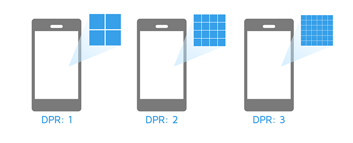
- Device Pixel Ratio – Tells the browser how many actual pixels the device is going to use to draw a single CSS pixel.
There are over 55 popular mobile devices (and variants) available for simulation, including:
| Brand | Model | Device Type |
|---|---|---|
| Apple | iPhone 16 Pro Max | Phone |
| Apple | iPhone 16 Pro | Phone |
| Apple | iPhone 15/16 | Phone |
| Apple | iPhone 15+/16+ | Phone |
| Apple | iPhone 13/13 Pro/14/16e | Phone |
| Apple | iPhone 13 Pro Max/14+ | Phone |
| Apple | iPhone 12 mini/13 mini | Phone |
| Apple | iPhone 6/6S/7/8/SE (2nd/3rd Gen) | Phone |
| Apple | iPhone 6/6S/7/8 Plus | Phone |
| Apple | iPhone 5/5C/5S/SE (1st Gen) | Phone |
| Apple | iPhone 4/4S | Phone |
| Apple | iPhone XR | Phone |
| Pixel 8/9/9 Pro | Phone | |
| Pixel 6 Pro | Phone | |
| Pixel 6 | Phone | |
| Pixel 4a/5/5a | Phone | |
| Pixel 3a/4/4 XL | Phone | |
| Pixel 3 XL/3a XL | Phone | |
| Pixel 3 | Phone | |
| Nexus 6/6P/Pixel XL/Pixel 2 XL | Phone | |
| Nexus 5X/Pixel/Pixel 2 | Phone | |
| Nexus 5 | Phone | |
| Nexus 4 | Phone | |
| Samsung | Galaxy S25+/S25 Edge | Phone |
| Samsung | Galaxy S24 Ultra/S25 Ultra | Phone |
| Samsung | Galaxy S23/S24/S25 | Phone |
| Samsung | Galaxy S21/S21+/S21 Ultra | Phone |
| Samsung | Galaxy S10/S10+ | Phone |
| Samsung | Galaxy S8/S8+/S9/S9+ | Phone |
| Samsung | Galaxy S6/S7 | Phone |
| Samsung | Galaxy S4/S5 | Phone |
| Samsung | Galaxy Note 20/20 Ultra | Phone |
| Samsung | Galaxy Note 10/10+ | Phone |
| Samsung | Galaxy Note 8/9 | Phone |
| Samsung | Galaxy Note 4/5 | Phone |
| Samsung | Galaxy Note 3 | Phone |
| Samsung | Galaxy A36/A56 | Phone |
| OnePlus | Nord CE4 Lite | Phone |
| OnePlus | Nord/Nord 2/9/10T/10R | Phone |
| OnePlus | 9 Pro/10 Pro | Phone |
| OnePlus | 12/13 | Phone |
| Nokia | Lumia 520 | Phone |
| Apple | iPad Air 4/5 | Tablet |
| Apple | iPad Air 6/Pro | Tablet |
| Apple | iPad Mini 6/7 | Tablet |
| Apple | iPad Pro (2024) | Tablet |
| Apple | iPad 6/7 | Tablet |
| Apple | iPad 9/10 | Tablet |
| Nexus 7 | Tablet | |
| Pixel Tablet | Tablet | |
| Samsung | Galaxy Tab A 10.1 | Tablet |
| Samsung | Galaxy Tab S3 | Tablet |
| Samsung | Galaxy Tab S9 Ultra/S10 Ultra | Tablet |
| Samsung | Galaxy Tab S9+/S10+ | Tablet |
| Samsung | Galaxy Tab S9/S10 | Tablet |
| Samsung | Galaxy Tab 4 | Tablet |
We’ll be adding more over time, to ensure the most up-to-date and commonly used devices are represented.
Why Screen Resolution Matters
Screen resolution is the size at which a website is rendered. Desktop monitors have larger resolutions than mobile devices, and due to responsive design, varying resolutions will trigger varying layouts and styling.
Because your website could be visited from devices of all sizes, it is important to ensure that it is optimized for screen sizes most used by your visitors.
Why Device Pixel Ratio (DPR) Matters
Device Pixel Ratio in simplistic terms is how many pixels are packed in a screen. Different mobile devices have different Device Pixel Ratio – from Quad HD displays, to Apple’s Retina Display.
This feature ensures that if your responsive design uses the device
-min-device-pixel-ratio: value media query, the proper assets/layouts will be rendered for the GTmetrix analysis.
You may want to serve a higher resolution photo for higher pixel density displays for example.
What Doesn’t it Do?
Simulate Device does not simulate hardware performance, and thus actual loading behaviour may differ on an actual device.
Devices have a varying range of hardware specifications and performance, which all contribute to the loading speed of a website. We’re simulating the resolution, user-agent, and device pixel ratio of the device – some of them are the same (i.e., iPhone 6 and iPhone 8).
Because we cannot simulate the hardware performance for each device, it is still recommended to test your page on the actual device in order to get real world performance benchmarks. Naturally, an iPhone 8 would load a modern website faster than an iPhone 6, because it has a better processor, more memory, etc.
Our Simulated Device feature gives you a good starting benchmark to gauge your performance on these devices, but they should not be regarded as 1:1 comparisons.
How to Use It
To simulate a device, enter a URL into the Analyze field first, then select a device using the “Device/Browser” dropdown.
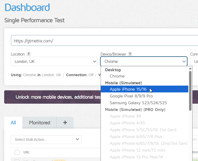
You get a limited selection of Simulated Devices on Basic/Free accounts, but PRO users can access the full suite of 55+ devices and variants.
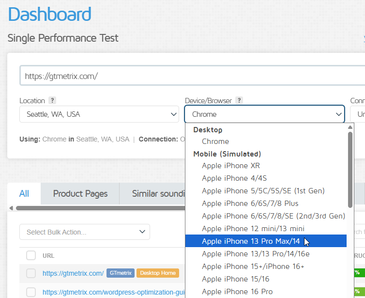
When you select a device, you’ll see the screen resolution, user-agent and device pixel ratio settings being prefilled to that device’s specifications.
You can modify the User-Agent if needed but the Screen Resolution and DPR are locked (you cannot change these values).
Select an appropriate connection speed (4G Slow, 4G, LTE, or a Custom Connection Speed) to ensure your results align better with your real-world visitors.

Click Analyze – GTmetrix will test your page with the simulated device settings.
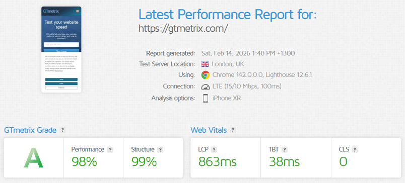
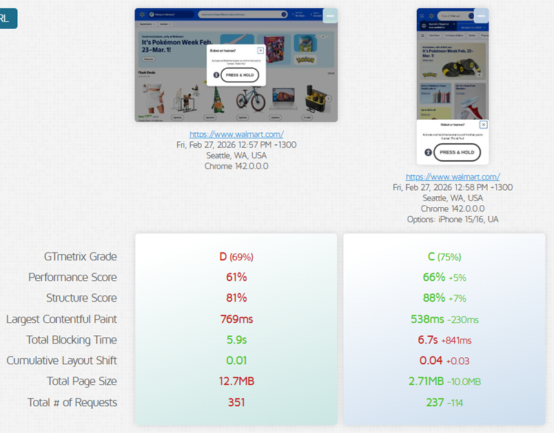
A report will be generated with the site screenshot at the correct screen resolutions and details of the page load.
Test as a Desktop Device or any Other Screen Resolution
For you to test as a Desktop device or any other Screen Resolutions, you’ll have to change the “Device/Browser” option to Chrome.
Then expand the “Advanced Options” and under the “Screen Resolution” dropdown, select the desired resolution you wish to test with.
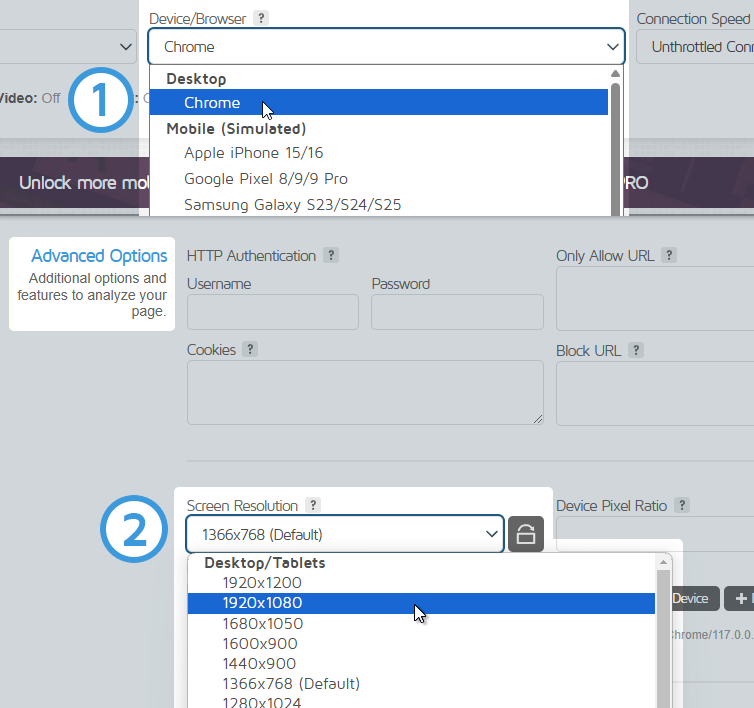
You can leave Device Pixel Ratio (DPR) as blank (default) or set it to 1.
More Usage Scenarios
Here are some more ways to use Simulate Device to get even more insights:
Change the Connection speed to match your visitors
To even further simulate a mobile experience, you can change the connection speed to reflect what users would likely be experiencing.
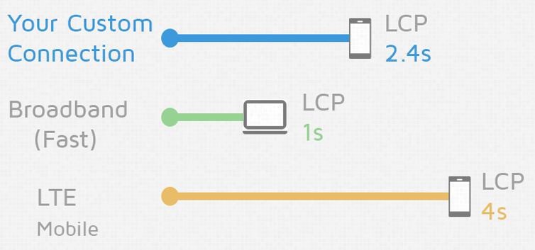
For example, test your page performance for a Google Pixel 3 using a 4G Slow connection, or an iPad Air 6 on a 5G connection.
Simulate a device around the world
You can test, monitor, and use the API with simulated devices in all of our global test regions (location access depends on your chosen plan).

In addition to monitoring your default Desktop view, we recommend also monitoring for various simulated devices around the world.
Test sites that use browser detection/user-agent sniffing
Overriding the User-Agent lets you collect the various results that may be delivered if a site uses Browser detection or User-Agent sniffing.
Benefits
Our Simulate Device feature gives you insight on your page’s performance with the most used devices today. Visitors may be coming from all types of devices and screen resolutions, so it’s best to test for the most commonly used.
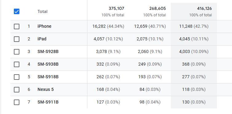
Your Website Analytics can give you an idea of which devices are used the most.
With monitoring and alerts, you can ensure that you maintain consistent performance across your entire user base.
Frequently Asked Questions (FAQ)
Here are some common questions regarding Simulated Devices in GTmetrix.
What is GTmetrix’s Simulate Device feature?
GTmetrix’s Simulate Device lets you test (and monitor) your website as if it were loaded on a specific mobile or tablet device by adjusting screen resolution, user-agent, and device pixel ratio (DPR).
How do I simulate mobile devices in GTmetrix?
Enter your URL, expand the Analysis Options, and select a device from the “using” dropdown. GTmetrix will automatically apply that device’s screen resolution, user-agent, and DPR for testing.
How accurate is GTmetrix device simulation and does it simulate real device performance?
GTmetrix provides a reliable benchmark for layout and asset delivery, but it is not a 1:1 representation of real-world performance because GTmetrix does not simulate actual mobile hardware performance like CPU or memory. It only mimics browser-level characteristics, so results may differ from real-device testing.
Can GTmetrix test website performance on iPhone and Android devices?
Yes, GTmetrix supports simulation for 55+ popular devices, including iPhone, Samsung Galaxy, Google Pixel, and various tablets.
Why is testing different screen resolutions important for website performance?
Different screen sizes trigger different responsive layouts, which can impact load behavior, layout shifts, and overall page experience.
What is Device Pixel Ratio (DPR) in GTmetrix testing?
Device Pixel Ratio (DPR) is a value that defines how many physical pixels are used per CSS pixel. It affects image quality and determines whether high-resolution assets are served.
Can I change the user-agent in GTmetrix device simulation?
Yes, you can override the user-agent to test how your website responds to different browsers or devices, especially if it uses user-agent detection.
Can I test my website across different network speeds in GTmetrix?
Yes, you can combine device simulation with throttled connection speeds like 3G, 4G, or LTE to better reflect real user conditions.
How do I choose which devices to test in GTmetrix?
Use your website analytics to identify the most common devices your visitors use, then prioritize testing with those devices for better real-world results.
Can I simulate desktop screen resolutions in GTmetrix?
Yes, select “Chrome” as the test browser and manually choose a screen resolution to simulate desktop or custom viewports.
Is GTmetrix Simulate Device available on free accounts?
Yes, the Simulate Device feature is available on free accounts with limited devices.
Full access can be unlocked by upgrading to a GTmetrix PRO plan.
Simulate Device is available to PRO users only

Simulating Devices is available on all PRO plans, along with more Advanced Analysis Options like Analysis Presets, DNS Overrides, Custom Connection Speeds and more!
As a PRO user, you’ll also get an enhanced GTmetrix experience with: Priority access for tests, More Monitored Slots, Hourly Monitoring (select plans only), Remote Location Monitoring (including Premium Test Locations), and more!