In this guide, we show you how to view and interpret CrUX data in the GTmetrix Report.
Overview
The CrUX tab in the GTmetrix Report displays real user data for your page, derived from Google’s Chrome User Experience Report (i.e., CrUX).
This data provides insights into how real users experience your page in the wild, offering a different perspective to the lab (synthetic) data that you otherwise see in the GTmetrix Report.
In this guide, we explain how to view and interpret the CrUX data in the GTmetrix Report.
How to View CrUX Data in the GTmetrix Report?
On the GTmetrix Report, simply visit the CrUX tab to see all of the field metrics collected by Google in the CrUX dataset.
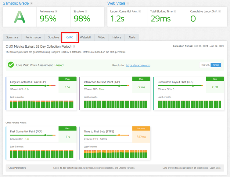
On the CrUX tab, you’ll see the latest CrUX data for your page (or origin) for the latest 28-day collection period, along with an Overall Core Web Vitals Pass/Fail Assessment (more on this below).
Note that the CrUX tab is only visible on Lighthouse-based reports i.e., the CrUX tab is not available in Legacy Reports (PageSpeed/YSlow).
GTmetrix CrUX data will differ from Google PageSpeed Insights (PSI) data
The CrUX data offered in GTmetrix is based off an average of ALL devices (as opposed to PSI’s Mobile and Desktop distinctions).
This aims to simplify benchmarking and streamline comparison, while still providing real world data for performance optimization efforts. Learn more here
What Data is Available in the CrUX Tab?
Data is provided for these 5 metrics:
- Largest Contentful Paint (LCP): Measures loading performance
- Interaction to Next Paint (INP): Measures responsiveness (Replaces Total Blocking Time)
- Cumulative Layout Shift (CLS): Measures visual stability
- Time to First Byte (TTFB): Measures initial server response
- First Contentful Paint (FCP): Measures initial loading performance
The CrUX tab can mainly be broken down into the following sections:
Metric Distribution/Breakdown
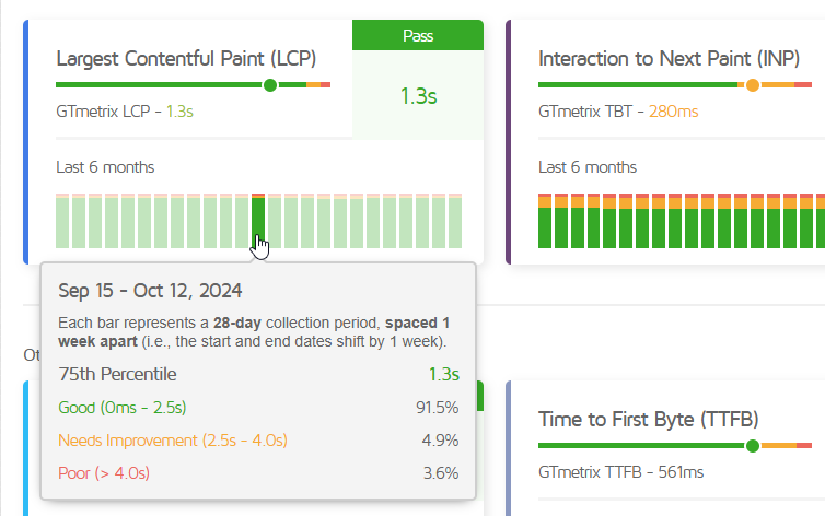
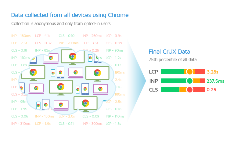
The 75th percentile is a statistical indicator that Google uses to rate user experiences for your page.
It is the value that marks the point at which 75% of data points in a sample set are below it.
For example, if your LCP’s 75th percentile is 1.5s, that means over 75% of your page visits had an LCP value quicker than 1.5s.
In other words, the lower the 75th percentile, the better your visitors’ page experiences.
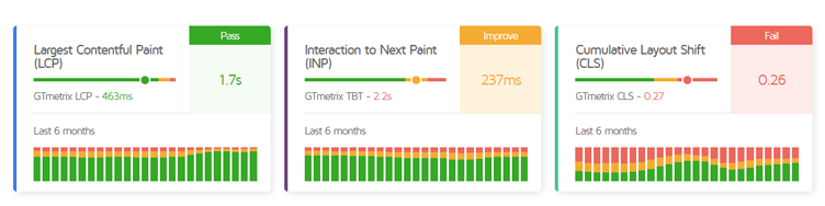
For each metric in the CrUX dataset, the 75th percentile is compared to Google’s thresholds for a “delightful” user experience.
Depending on how this value compares to the thresholds, you’ll see a colour coding for this value, along with a Pass, Improve, or Fail assessment.
To the left of this value sits the slider bar – a statistical representation of all of your real-world page visits. The colour distribution on this bar is a visual indicator of what percentage of page visits were good, mediocre, or poor.
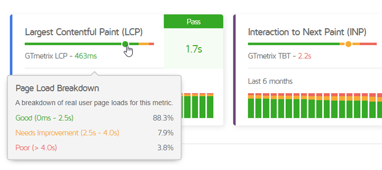
Hovering over this bar will reveal the percentages (along with the thresholds for Good, Needs Improvement, and Poor).
The circle marks the 75th percentile. If at least 75% of page experiences are quicker than the “Good” threshold, your page will pass.
In other words, if this value falls in the green zone, your metric will pass. Otherwise, it may be marked as “Improve” or “Fail“.
For example, if your page’s LCP metric has the following distribution:
- Good (0-2.5ms): 88.3%
- Needs Improvement (2.5-4.0s): 7.9%
- Poor(>4.0s): 3.8%
Since 88.3% of page experiences are Good, your 75th percentile (1.7s) will easily fall in the green zone and your metric will pass.
However, if your page had the following LCP distribution:
- Good (0-2.5ms): 70.5%
- Needs Improvement (2.5-4.0s): 14.2%
- Poor(>4.0s): 15.3%
Since there are only 70.5% good experiences, so the 75th percentile will not fall in the green zone, instead being pushed into the Needs Improvement (amber) zone with a value of 3.3s. In this case, the metric will be marked “Improve”.
In summary, aim for more green on each bar as that indicates a more positive page experience for your visitors.
GTmetrix Lab (Synthetic) Result
For each metric, you’ll see the lab (synthetic) result for that particular metric for easy comparison with the field data.
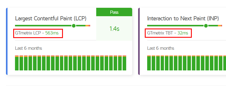
4 out of the 5 metrics available on the CrUX tab (i.e., FCP, LCP, CLS, TTFB) can be measured in the lab.
INP is a field-only metric which cannot be measured in the lab. Hence, the TBT is displayed for comparison as it is the metric that best correlates with INP.
For each metric provided (except TTFB), the lab (synthetic) value is colour-coded depending on how your page did in that metric.
CrUX TTFB May Differ From GTmetrix TTFB
The Time to First Byte (TTFB) reported by CrUX has a different definition to the TTFB reported by GTmetrix.
In GTmetrix, TTFB is the sum of Redirect Duration, Connect Duration, and Backend Duration.
For CrUX, TTFB may not include Redirect Duration as the data is only provided for the final URL.
Histogram Averages
Below the GTmetrix lab (synthetic) result, you’ll see a number of histograms for each metric.
While the slider bar represents data for the latest 28 day collection period, the histogram bars represent data for previous data collection periods.
Hovering over the bar shows the date range, 75th percentile for that metric, and the percentage distribution of page experiences.
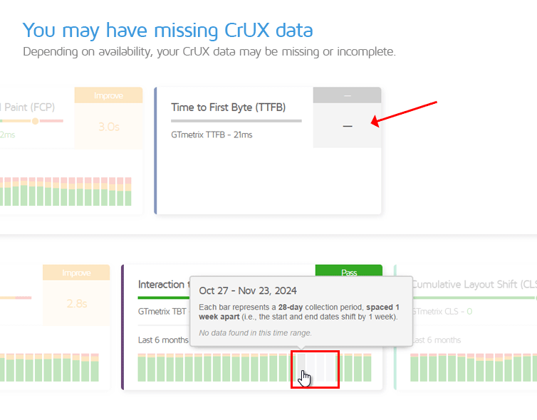
Each histogram bar represents a 28 day collection period, spaced one week apart (i.e., the start and end dates shift by 1 week).
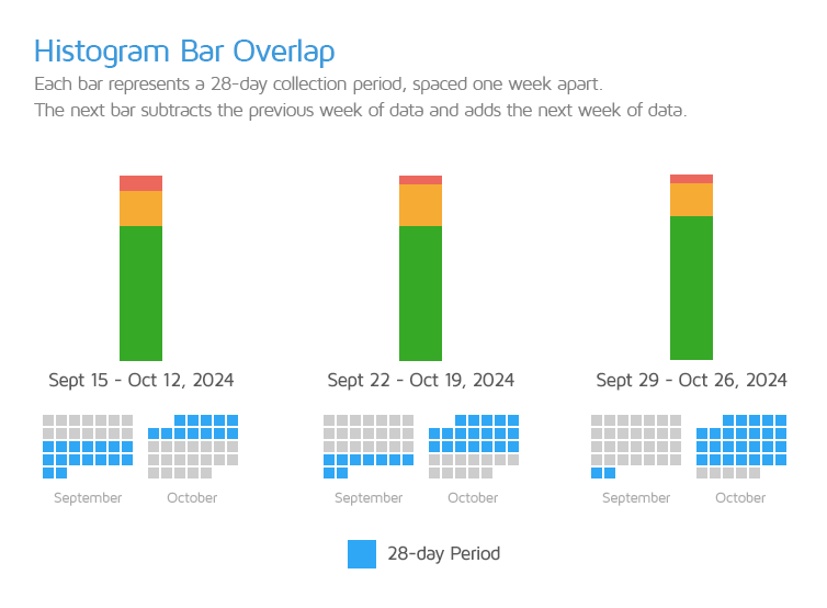
In other words, if the histogram bar on the right represents the September 29, 2024 – October 26, 2024 period, then the histogram bar immediately to its left represents the September 22, 2024 – October 19, 2024 period.
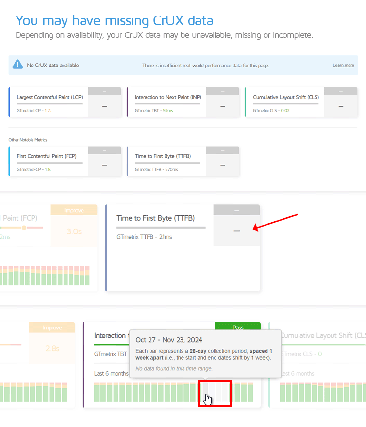
Depending on how much data is available for your page, you may see missing data or no data for some bars.
Basic/Free and PRO users also have access to different retention periods for historical CrUX data. PRO users can view historical CrUX data for the last 6 months (i.e., 25 weekly intervals).
For Basic/Free Users
Basic users can view histograms for the last month (i.e., 4 weekly intervals).
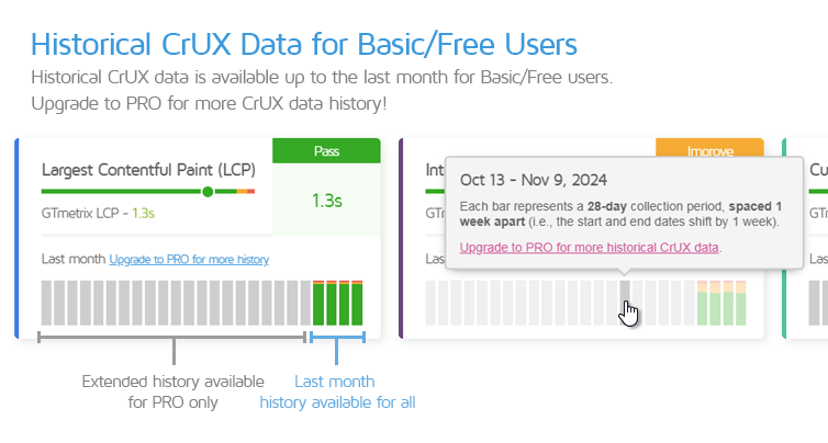
Basic users can hover over the greyed out bars to ascertain if more data is available.
If no data is available for a specific data collection period, the bar will appear in a lighter shade of grey. Hovering over these tool tips will also specify that there is “No data found in this time range.”
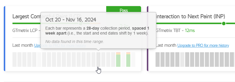
The bars that appear in a darker shade of grey indicate that more data is available for those data collection periods. Hovering over these tooltips will reveal a link to upgrade to PRO to access more historical data.
Web Vitals Assessment Section
At the top of the CrUX tab, you will see an overall assessment of your Web Vitals.
If all 3 of your Web Vitals (i.e., LCP, INP, and CLS) pass individually, then your overall Core Web Vitals Assessment will also show as Passed.
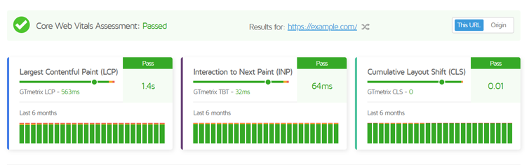
If one or more Web Vitals fail to pass, then your overall Core Web Vitals Assessment will show as Failed.
CrUX Data Caveats
The CrUX dataset is a powerful aggregation of real user data pertaining to a page’s performance, collected directly from Chrome browsers in a variety of real world scenarios.
However, there are some key things to know regarding how the dataset is comprised:
1) Only Well-Trafficked and Eligible Pages Will Have CrUX Data
Google has different eligibility criteria for CrUX data collection, not only for the websites but also the users who visit them.
If your page meets the eligibility criteria (i.e., has sufficient web traffic from eligible visitors), you will see CrUX data for your page. Note that your page and origin have to meet the eligibility criteria separately in order to be included in the CrUX dataset.
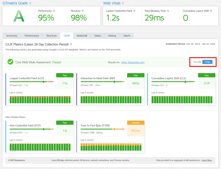
You can switch between viewing page-level and origin data using the toggle on the right-hand side.
2) CrUX Data (in GTmetrix) is an Aggregate Snapshot of “All” Experiences
Unlike Google’s PageSpeed Insights, which distinguishes Desktop and Mobile data, CrUX data in the GTmetrix Report does not distinguish between devices (mobile/desktop/tablet), locations, connection speeds, etc.
The data shown is an aggregate of all devices, network connections, and Chrome versions.
There are a few reasons why we’ve opted for an all encompassing display of CrUX data:
- Simplification of Benchmarking
Almost all websites utilize responsive design and have a mix of both Desktop and Mobile visitors. Broadly speaking, optimizations made on the website at large should reflect in both Desktop and Mobile visits.
- Ease of Comparison
Our goal is to provide real user metrics in a compact, easily accessible dataset. An All encompassing CrUX dataset aims to give broad, big picture approach to how all of your real users experience your website on any device.
- Minimizes Noise
Device specific data can be noisy, with outliers potentially causing slower than actual performance issues (slow phones, spotty network coverage, etc). Averaging across all devices smoothes out anomalies and ensures you’re optimizing for typical users rather than edge cases.
- Thresholds for Core Web Vitals are the Same Anyway
CrUX uses Mobile thresholds for both their Desktop and Mobile data – it is not distinguished per device.
An all-devices perspective ensures that CrUX data is both practical and actionable, giving you a clear, unified understanding of how your website performs for all users, regardless of device.
3) CrUX Data is Always Shown For the “Final” URL
Regardless of what page you test, CrUX data is always provided for the canonical URL (i.e., the actual/final redirected URL).
For example, Google’s canonical URL is https://www.google.com/. This is the actual URL used to access the site.
If you type google.com or https://google.com into your browser’s address bar, a redirect is executed to https://www.google.com/.
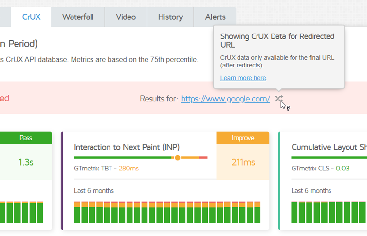
When this happens, the redirect symbol is shown, along with the canonical URL (i.e., the final redirected URL).
Note on Domain/URL Changes
Note that if your domain or final URL changes, it will create a separate entry for CrUX data, so keep that in mind if you see missing data for a URL which has changed in the last 25 weeks.
4) You May Have Missing Data
For eligible pages, there may be missing data for certain metrics and/or date ranges if your page encounters periods of insufficient traffic or gets visited by ineligible visitors.
This may happen at either the page or origin level (or both).
5) Origin Data Maybe Shown in Place of Page Data
When there is insufficient data for your specific page, the CrUX tab may default to the origin data, which is an aggregate of all the pages on your site.

When this happens, the toggle on the right-hand side is disabled as there is no page-level data in this scenario.
6) Your Page May Have No Data
If your page doesn’t meet the eligibility criteria, it may not have any CrUX data at all.
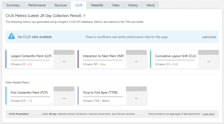
This could be due to insufficient traffic, visitors using unsupported platforms (e.g., iOS, Microsoft Edge), or your page not being publicly discoverable, etc.
Summary
The CrUX tab brings field data into the GTmetrix Report through Google’s CrUX API. These real-world insights offer a different perspective on your page’s performance to go with the lab (synthetic) data provided in the GTmetrix Report.
In this guide, we’ve explained what data is available, and how to view and interpret them.
With both lab (synthetic) and field data under one roof, use these insights to further guide and validate your web performance optimization efforts.
Further Reading
You can read more about what CrUX data is and how it differs from lab (synthetic) data here:
Test with different countries, speeds, and options
Get access to different Test Locations, Analysis Options, and Connection Speeds!
Sign up for a Basic GTmetrix account and see how your site performs – It’s FREE!
Get Mobile Testing, Premium Locations, and more
Get more On-Demand Tests, Monitored Slots, and Premium Test Locations, and more! with a GTmetrix PRO plan.
Upgrade to GTmetrix PRO and see how your site performs in all scenarios.