Do you want to use a slider on your homepage? We explain when you can do so and suggest some alternatives for when you probably shouldn’t.
Overview
We’ve previously covered the pros and cons of using sliders and carousels on your homepage.
However, despite all the issues surrounding sliders, you may still be interested in using a slider or have a client who insists on having one.
In this article, we’ll discuss which scenarios are actually suitable for slider use and suggest alternatives for sliders in the interest of a better user experience.
GTmetrix Poll Suggests Majority of Users Dislike Sliders on the Homepage
Before we get into the specifics of where you can use sliders, here’s some real-world opinions about them.
We polled users on various social media platforms (Facebook, Twitter, LinkedIn) on whether they were using sliders on the homepage.
Specifically, we asked them for their thoughts on the overall effectiveness of having sliders on their website – taking into account their impact on page performance, UI, and the user experience.
This is what we found:
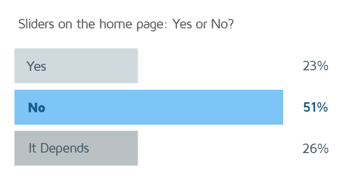
Clearly, most people are against sliders on the homepage.
It all comes down to the fact that developers don’t like using them for both performance and design/functionality reasons. It’s often the case that sliders and carousels only exist on many homepages because clients want them.
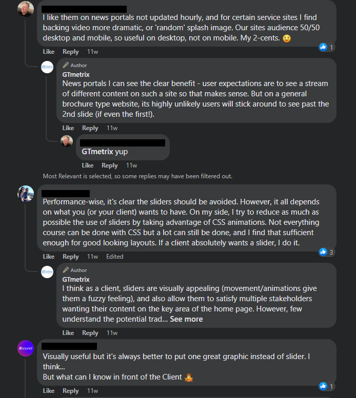
Even when users didn’t say No, opinion was split between Yes and It depends.
The bottom line is less than a quarter of the users we polled said they absolutely like using sliders on the homepage of their website.
So you might be wondering – should you use sliders and carousels on your website at all?
Depending on who you ask, you’ll get varied opinions – many (like WP Rocket) are firmly against sliders while some still think they’re a good idea, and of course, others will tell you that it really depends on the use case.
Sliders Aren’t Completely Useless
Yes, sliders aren’t a great focal point for your website and we think it’s best to use alternatives in the interest of performance and better engagement.
That being said, you can still use sliders in certain situations (mostly below-the-fold), such as:
1) Photo Galleries
If you run a photography website, or are selling something that’s heavily reliant on visuals, then sliders and carousels are a great way to showcase that.
We’d still recommend not placing the sliders above-the-fold in the interest of performance (and a quick LCP).
By placing the slider “below-the-fold” and not making it the focal point of your website, you can improve the performance of your page as the browser isn’t trying to load the slider first, enabling other critical content to load faster.
You can also lazy load your below-the-fold slider images for an added performance bonus. No matter what you do, always make sure that your images are properly sized for target devices and optimally compressed for lower file sizes.
It’s also preferable that you don’t use automatic sliders and instead let users manually scroll through your photos, for the following reasons:
- Performance penalty – more JavaScript is required to automate the rotating carousels.
- User Frustration – Automatic sliders can both distract and frustrate your visitors, due to:
- Lack of control – slides may be moving too fast or in a janky manner (also reducing accessibility for some visitors).
- Unclear navigation structure – slider may use arrows, dots, or swipes (on mobile) to move to the next slide.
2) Featured Products/Categories
Sliders can be useful when you’re working specifically with products, especially when you want to show off featured products or categories.
For example, websites that deal with fashion or jewelry (or jewellery, if you prefer) are particularly good candidates for sliders because of the visual nature of the products.
A well-purposed slider can help your visitors showcase what your products look like and the available selection, setting the stage for further engagement.
3) Client Logos or Testimonials
Sliders may be well-suited to display logos of clients, partners, or companies you work with. Testimonials are another great use-case for sliders and carousels, especially if the slider is located further down your page.
This way, you’re not stealing your visitors’ attention away from what your website is all about (and your page loads faster). In fact, testimonials are a great way to showcase social proof of your product/service, and sliders are a good way to call attention to it.
I Still Want (or My Client Insists on) a Slider on the Homepage
It’s often the case that your client insists on using a slider (or you secretly want to) on the homepage, despite all the shortcomings associated with sliders.
In this scenario, here are some things you can do to mitigate performance and engagement issues:
1) Keep it Light
Make sure you use a lightweight slider to minimize the negative performance impact on your site.
The simpler the slider, and the lighter the images, the smaller the performance hits to your site.
Here are some things to consider:
- Don’t set the slider to automatically switch between slides – let your visitors have full control over slider navigation.
- Choose sliders that are easy to navigate so that your visitors don’t have to spend time figuring out how to move to the next slide.
- Use simple transitions and avoid fancy complex and/or non-composited animations to ensure that your site responds well to user inputs.
- Ensure that your slider is responsive (i.e., scales according to device screen size) and your images are optimized for your target device. More on this below.
2) Minimize Number of Slides
If you must use a slider to tell your website’s story, ensure that your messaging is consistent – one way to do that is to limit the slider to a maximum of 2 or 3 slides.
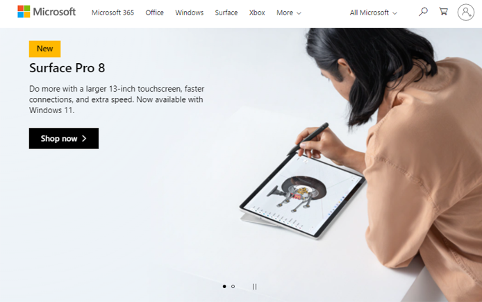
This should be enough to convey your site’s value proposition and most visitors don’t scroll past the first few slides anyway.
Another good practice is to design the slider in such a way that each slide feeds into the next one so that you keep your visitors engaged.
3) Use Responsive Sliders
Responsive sliders automatically scale in size according to the width of your visitor’s device. This ensures that the slider doesn’t break your website’s layout and is usable across multiple devices.
Make sure to choose sliders that allow for html text overtop imagery (i.e., layers of
<h1>, <h2>, and/or other text related elements). This makes your text highlightable and legible on smaller screens as opposed to having your text shrink when images with text are scaled down for smaller screens.
There is also an added SEO benefit as highlightable text can be crawled by search engines, which may help with your site’s search engine ranking.
Alternatives to Sliders
Having talked about where slider usage is acceptable and how best to implement them, let’s consider slider alternatives that may be better for your site, both in terms of page performance and engagement/conversion.
This may include any of the following:
1) Single Hero Image
A single hero image with a clear, purposeful message is widely regarded as one of the best design practices for top-converting websites. It also ties in with Google’s key criterion for their search engine ranking algorithm – content relevance.
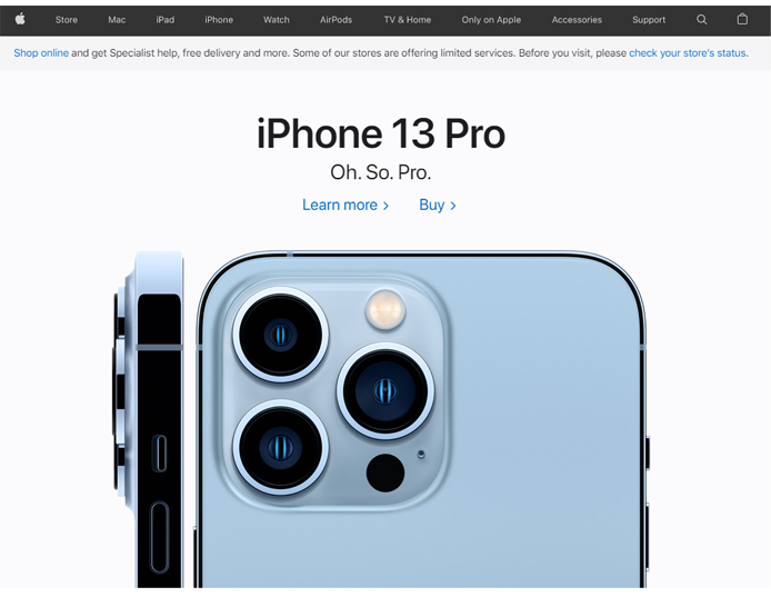
Basically, visitors are coming to your website for a reason, whether it’s to buy a product or to solve a particular problem.
Since the hero image would usually take up a large portion of the above-the-fold space on your homepage, you can use it to convey your value proposition, thereby addressing the user’s reason for visiting your website.
A single hero image loads faster and can eliminate ambiguous messaging so your visitors see content faster and can quickly grasp what your website is all about.
2) Targeted Call-To-Action (CTA)
This ties in with displaying a single hero image instead of using a slider/carousel. A strong targeted CTA for a particular product or service or contact link can tell visitors straight away what to do when they visit your website.

By removing the guess work, visitors don’t need to explore your whole site in order to understand what your site is about and what needs to be done next.
The hero image in conjunction with the CTA is better for performance, clearly conveys your site’s message, and it has also shown to be much better for conversions.
3) Search Bar
If your website offers a lot of products or services, then your visitors may benefit more from having a readily accessible search bar (i.e., Find your product) instead of a slider.

Even though visitors can browse through your website to explore the different products/services on offer (which is why some use sliders in the first place), a search bar can help visitors easily find whatever it is they’re looking for.
4) Video Content/Messages
To be clear – we don’t mean full screen background videos of natural scenery or glamour shots of your products. We’re referring to video content with a message or story that provides information to compel them to engage with you.
Such videos have been known to convert very well because, “…people prefer watching over reading.”

Unlike sliders, videos usually focus on a single story – answering the question as to why you visited the website, and what the website has to offer, whether it’s a product or service or information on a particular topic.
Videos can work as a great online marketing tool because they can be personalized and tailored to target specific users.
Read more here on some great tips for homepage videos.
Keep in mind that large unoptimized videos can impact your page’s performance so consider using some performance-minded strategies, such as using a placeholder image and only loading the video when the user clicks on it (AKA Lazy load third-party resources with facades).
Summary
Sliders and carousels are highly contentious on the Internet. Our recent poll confirms what we’ve always suspected – clients love them while most developers hate them.
They appeal to clients because they’re relatively easy to add, everybody can get a spot on the homepage, and they bring an array of animations, transitions, and special effects.
However, developers strongly dislike them because of their many performance and UX drawbacks, and the fact that they’re not great for user engagement, conversions, and/or SEO.
While you may still use a slider in certain scenarios (e.g., below-the fold photo galleries, testimonials, etc.), it’s best to avoid making them the focal point of your website.
There are better alternatives available (e.g., strong hero images, targeted CTAs, video messages, etc.), both in respect to web performance and user engagement and conversion.
Further Reading
We’ve tried to objectively explain what you should do if you (or a client) wants to use sliders on your homepage. Depending on who you ask though, you may get stronger opinions that lean toward completely avoiding sliders, or embracing them entirely.
Below are some more articles on whether you should use sliders and carousels on your site:
- Why You Shouldn’t Use a Slider on WordPress (And Other Performance Bad Practices)
- Sliders suck and should be banned from your website
- Rotating Banners? Just Say No!
Keep your site’s performance at the top of your mind
Get more On-Demand Tests, Monitored Slots and Premium Test Locations along with Hourly testing with a GTmetrix PRO plan.
Other features include: Priority queue access, Mobile Testing, Remote Location Monitoring (including Premium Locations), and more!
Need More Help?
We recommend finding help using one of our optimization partners. They’re a great option for website owners that want to improve performance, but don’t have the technical skill to implement optimizations.
We only recommend products and services that we’ve reviewed and tested ourselves. If you decide to purchase their services through the links provided, we may be paid a commission at no extra cost to you.
Hire a Developer
We recommend finding help on Fiverr. This is a great option for website owners that want to improve performance, but don’t have the technical skill to implement optimizations.
Visit Fiverr, register for an account, and search for a speed optimization service that matches your platform, whether it’s WordPress, Magento, Shopify, Squarespace, Opencart, etc.


