Do you use a slider/carousel on your homepage? Learn why this polarizing feature may not be the most optimal solution for your website.
Overview
Sliders and carousels are ubiquitous on the internet as they represent a great visual feature to display content on your homepage. However, many website owners often overlook their performance implications.
Simply using sliders to display as much content as possible above-the-fold on your homepage may not be the best approach, both not only in terms of performance, but user experience and overall effectiveness too.
In this article, we’ll present both sides of the argument and explain why you should revisit your website strategy if you’re using sliders and carousels.
Pros of Using Sliders
First, let’s look at a few benefits that are brought about by adding sliders to your page:
1) Easily Add Multiple Headline Content on the Homepage
Sliders/carousels are useful when you have multiple key headlines to present.

For example – news websites, online magazines, review sites, etc. are good candidates for sliders because visitors expect to see a stream of different content.
2) Display More Content on the Page
Similar to the previous point – sliders/carousels can help you fit more content in general on your homepage.

Every department (e.g., sales, marketing, etc.) can have a spot on the homepage, in turn “satisfying the committee” as a whole.
Another benefit is to easily present sale promotions or latest updates front and centre on your page so that it’s one of the first things visitors see.
3) Easily Add Dynamic Motion to the Page
Many sliders/carousels allow you to easily add some form of dynamic motion to your page (e.g., animations, special effects, video playback, etc.)
This is often very appealing to website owners, who may feel that the animated nature captures the attention of visitors (potentially a myth as we explain below).
Cons of Using Sliders
There are many disadvantages to using sliders. We list the important ones below:
1) Worse Site Performance
This is easily the biggest drawback of using sliders/carousels, and is the primary reason why many are against using them.
Here’s how sliders impact your site’s performance:
a) More Requests, More Demands, and More Script Execution
Sliders and carousels usually require extra CSS and JavaScript code for their functionality, increasing the number of overall requests required to load your page (images, CSS, JavaScript).
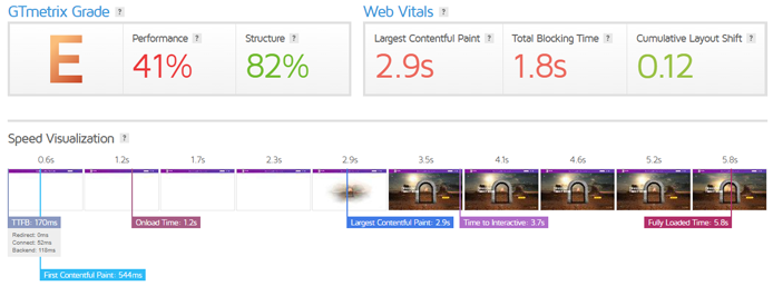
More CSS usually equals more render-blocking behaviour, which extends your page’s Largest Contentful Paint (LCP) timing.
Meanwhile, a higher JavaScript execution time may result in excessive main-thread blocking, impacting your page’s Total Blocking Time (TBT).

Some sliders also engage in potentially problematic behaviour by repeatedly requesting images, not only delaying the time taken to finish loading your page, but also increasing data costs for your mobile visitors.
We’ve seen instances of GTmetrix failing to analyze some pages with sliders because some scripts keep requesting images to the point where Lighthouse is unable to determine a Time to Interactive (TTI) timing for the page, before our test cut-off point.
b) Heavy Above-the-fold Resource Demands
If you have a slider as the focal point of your homepage (i.e., the LCP), it likely has a detrimental effect on performance because the browser needs to do a lot of work to render the various elements.
This means processing CSS to determine styling, loading several images for display, and executing JavaScript to add dynamic functionality – all in a key area of your page.
This will likely extend your page’s LCP as the browser has to do all the above before your visitors can view the banner image on your page.
If your slider functionality involves some form of animations or special effects and/or multiple images, it could make it even worse as things like slow fade-ins, transitions, and white canvas renderings are known to excessively delay LCP.
2) Sliders Aren’t Effective
Even if you can accept the hit in performance (which you shouldn’t), sliders are often not the most effective way to display content on your page. We outline a few reasons why:
a) Lack of Engagement
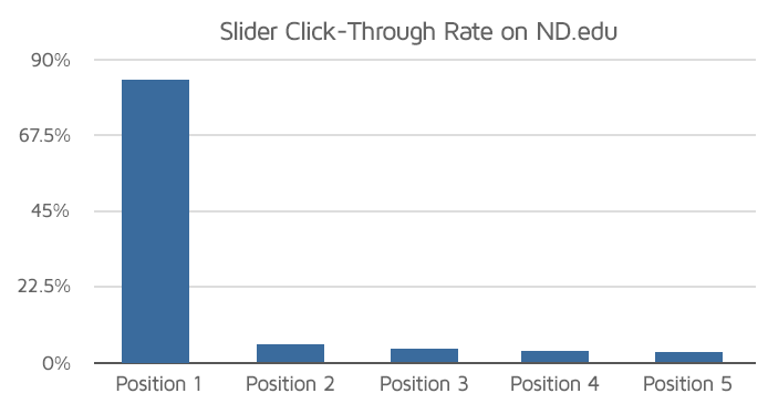
Sliders pretty much offer little to no engagement past the first slide.

Even when you consider the first few slides, studies have shown that users barely interact with them, as evidenced by the extremely low click-through rates.
b) Lack of Clarity / User Frustration
Multiple slides are not the best way to clearly showcase your key value proposition. All too often we see sliders containing too many messages resulting in no clear focus.
In addition, they can also remove control from your visitors, especially when you have the slides on auto play. In some cases, the duration until the next slide may be too brief for the visitor, causing them to miss your message.
Combined with sliders not having a universal navigation structure (some use arrows, others use dots, some require you to swipe, some have no navigation at all) – sliders can certainly frustrate your visitors to the point where they simply ignore it all together.
c) Banner Blindness
Banner blindness is a form of selective attention where some visitors ignore information presented in banners, usually because they may resemble ads.
Sliders have been known to evoke the same effect, and visitors may entirely skip your sliders because it gives them the impression that they are ads.
Removing sliders and using a static hero image with impactful messaging can often convey your message across more effectively.
d) Reduced Accessibility
Sliders may reduce accessibility for some visitors, depending on what type of slider is used. The slider may move too fast for low-literacy, low mobility, or vision-impaired visitors.
A static image is more effective as the lack of movement doesn’t create the same issues, and visitors can take their time to read and grasp the content presented at their own pace.
3) Problems on Mobile Devices
All of the issues related to desktop slider usage are present on mobile devices as well. Some of the issues (e.g., performance impact, user frustration) may even be exacerbated on mobile due to lower powered hardware and smaller viewports.
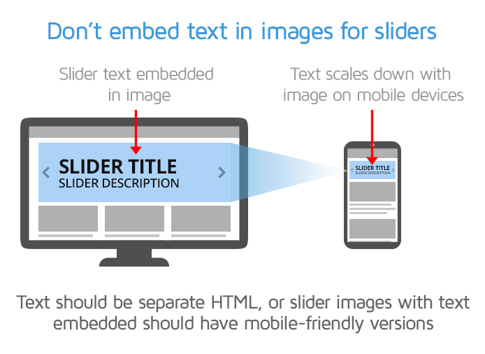
Sliders may pose some additional issues on mobile devices if they don’t follow responsive design.

Basically, the slider images need to be sized (or resized) for smaller screens and if they contain text, resizing the images for mobile screens could make the text illegible.
4) Potential SEO Impact
There are two main things here that can impact your site’s SEO ranking.
- First, if your slider image contains text, search engines can’t crawl it.
- Second, since sliders can negatively impact your site performance as previously mentioned, your Web Vitals may suffer.
Google uses Web Vitals as one of many signals in their search engine ranking algorithm.
If your site’s Web Vitals aren’t good enough, then your search engine ranking may be affected, resulting in potentially lower site traffic and fewer engagement/conversions.
Summary
Sliders and carousels may look fancy but many strongly dislike them because of their many performance and UX drawbacks, and the fact that they’re not great for user engagement, conversions, and/or SEO.
Moreover, sliders are often used to display as much information as possible, which can distract your visitors and may not convey a clear message.
With the drawbacks outnumbering the benefits, revisit your strategy to use sliders on your site and consider using alternatives instead.
Further Reading
We’ve tried to objectively explain why you should rethink using sliders and carousels on your site. Depending on who you ask though, you may get stronger opinions that lean toward embracing slider usage, or complete slider removal entirely.
Below are some more articles on whether you should use sliders and carousels on your site:
- Why You Shouldn’t Use a Slider on WordPress (And Other Performance Bad Practices)
- Should I Use a Slider on My Webpage? Slider Pros and Cons
- So Your Client Wants a WordPress Slider? Before You Cringe, Here’s What You Need to Know
Keep your site’s performance at the top of your mind
Get more On-Demand Tests, Monitored Slots and Premium Test Locations along with Hourly testing with a GTmetrix PRO plan.
Other features include: Priority queue access, Mobile Testing, Remote Location Monitoring (including Premium Locations), and more!


