Familiarize yourself with general web performance terms!
Overview
The world of web performance (and indeed GTmetrix) uses many technical terms and web-performance jargon that many users may not be familiar with.
This Glossary is intended to help you get a better understanding of commonly used terms that are referenced in our documentation, blog posts, and reports, or may otherwise be relevant within the context of GTmetrix usage.
A
Above-the-fold
“Above-the-fold” refers to the portion of the page that is within the user’s viewport. Basically, it is the area that the user normally sees on a webpage before having to scroll down to see the rest of the content.
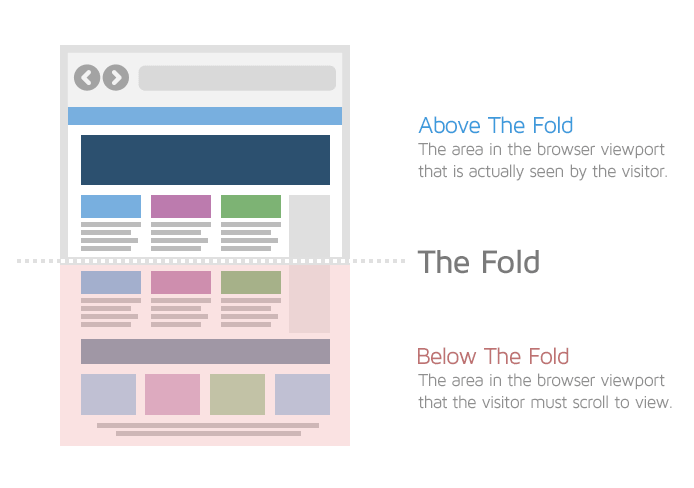
Above-the-fold area would change depending on the device used to access your webpage (mobile, desktop, tablet, etc.)
Adaptive Design
Adaptive design is a website design practice, in which, the layout of the website changes according to the screen width of the device used to access that website.
It is generally used to design separate versions of a website e.g., desktop-specific and mobile-specific websites.
In common practice, adaptive design is used to design a website for 6 common screen widths ranging from 320 px all the way up to 1600 px.
However, the actual number of versions depends on many factors such as budget, the individual website’s needs, designer’s preferences, etc.
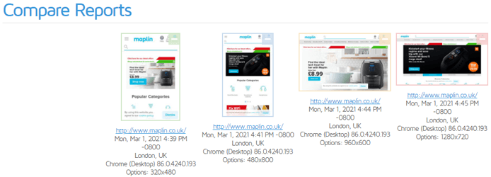
Adaptive design is similar to Responsive design in that the website’s layout (and subsequently page assets) changes based on the viewport; however, where this design philosophy differs is that it provides various pre-set layouts for different viewports.
Read more about Adaptive design and its differences with Responsive design here.
Asynchronous loading
Asynchronous loading refers to the process of loading scripts, stylesheets, and other resources simultaneously to prevent delays in the loading of your page.
Normally, resources are loaded synchronously i.e., one after the other. When resources are loaded in this manner, the browser must stop executing other tasks (i.e., stop rendering the page) and focus on loading these resources. This can drastically slow down the loading of your page.
Asynchronous loading enables the browser to load resources in parallel so that they won’t delay page rendering, facilitating faster loading of your page.
Typically, it is recommended that non-critical CSS and JavaScript files be loaded asynchronously in the interest of web performance.
B
Bandwidth
Bandwidth is the the maximum amount of information transmitted through the network in a given time period. Reducing bandwidth consumption can result in faster loading pages as fewer bytes of data are transferred, which speeds up browser execution time.
Strategies to reduce bandwidth consumption include, among others:
- Properly sizing images
- Efficiently encoding images
- Setting efficient cache policies for static resources
- Compressing and minifying your text resources
Below-the-fold
“Below-the-fold” refers to the portion of the page that is outside or below the user’s viewport. It is the area that the user normally sees after scrolling down the page.

Below-the-fold area would change depending on the device used to access your webpage (mobile, desktop, tablet, etc.)
BMP
BMP refers to the Bitmap image file format. It is a raster image format used to store bitmap digital images independent of display devices.
BMP images can be both monochrome and colour. BMP images are generally uncompressed and of higher quality than JPEG images.
Brotli
Brotli is a general purpose lossless compression algorithm developed by Google.
It is one of the best compression algorithms available today and is known to provide better compression for text-based resources (i.e, HTML, CSS, JavaScript) than GZIP compression.
Note that choosing brotli over GZIP isn’t a straightforward task. Even though brotli provides higher compression ratios than GZIP and is supported by most modern browsers, it is slower to compress data in the first place. Hence, choose your compression algorithm wisely.
C
Cache
A cache is a repository that temporarily stores data to help browsers, webpages and web applications load faster.
There are many kinds of caches used, like website cache, browser cache, as well as, server-side caches such as proxy cache, CDN cache, opcode cache, and gateway cache.
Browser caching is often used to speed up loading of webpages on repeat visits.
Cache Policy
A cache policy is a set of rules that determine whether a browser request for a static page resource can be served from the cache instead of the server, for returning users.
When set, the browser will store local copies of these resources in its cache and serve them to users on repeat visits, instead of downloading them again from the server. This helps your page load much faster on subsequent visits.
Setting an effective cache policy means ensuring that the latest page content is delivered to your page visitors in the quickest manner.
When the server provides a page resource, it uses the response headers to indicate that particular resource’s caching policy.
- Longer cache policies instruct the browser to store these resources in the cache for longer (e.g., 1 year). These are used for resources that are unlikely to change frequently, like logo images or page fonts.
- Shorter cache policies instruct the browser to store these resources in the cache for shorter periods e.g., 1 month. These are used for resources that may change frequently, like CSS or JavaScript files.
Caching Plugin
A caching plugin is basically a tool/piece of software that stores your entire website and its contents for improved performance.
It reduces the load on your host server by creating a copy of your website’s HTML and static content (CSS/JavaScript/Images) so that your server doesn’t need to dynamically generate your page every time a user wants to load it.
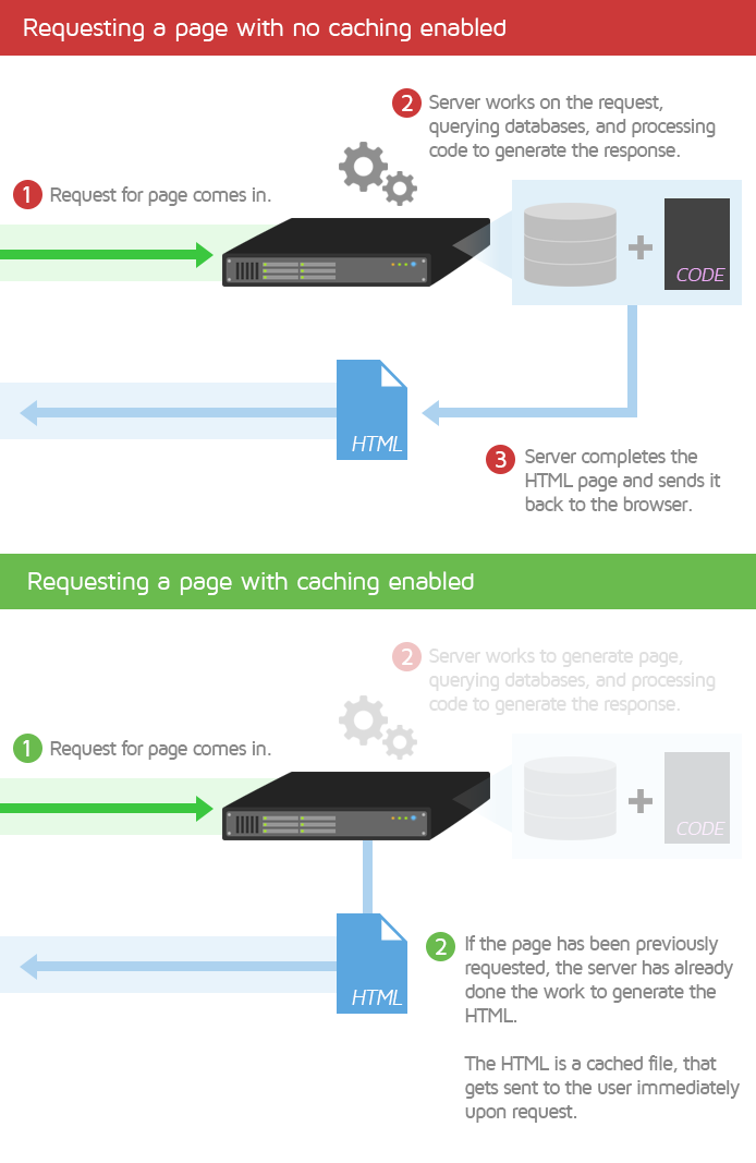
Caching plugins are commonly used in WordPress (or other CMS) and may be free or paid.
Some notable examples include WP Rocket (Premium performance/caching) and WP Fastest Cache (Free/basic caching).
Content Delivery Network (CDN)
A Content Delivery Network (CDN) is essentially a network of geographically dispersed servers. Each CDN node (also called Edge Servers) caches the static content of a site like the images, CSS/JavaScript files and other structural components.
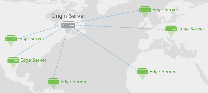
When a user requests your site, the node closest in proximity to the user will deliver the static content, ensuring the shortest distance for the data to travel (i.e., reduced latency), therefore providing the fastest site experience.
CDNs are a good way to ensure a consistently fast site experience for all your visitors, around the world.
Read our blog article to learn more about why you should use CDNs.
Content Management System (CMS)
CMS stands for Content Management System. It is an umbrella term for any software that is used to manage the creation and modification of digital content, such as your websites and all their associated content.
With a CMS, you can publish, organize, change, or remove various kinds of content, like text, images, video, interactive code, etc, without modifying code. The CMS provides a user interface for you to build and manage your website content more easily, as opposed to editing the website code directly.
CMSes can be categorized into various sub-classes:
- Self-hosted CMS
- These are CMSes that you can download and host on your own server.
- The most popular example is WordPress.
- Other examples include Joomla, Drupal, Magento, etc.
- Website Builders
- These are CMS services that you can subscribe to, hosted and managed by their respective parties.
- Examples include Shopify, Squarespace, Wix, etc.
Critical Rendering Path
The Critical Rendering Path is defined as “the sequence of steps the browser goes through to convert the HTML, CSS, and JavaScript into pixels on the screen.”
When a user tries to visit your page, the browser requests your origin server for your page’s HTML so that it can load the page.
When the server responds appropriately, the browser parses through your page’s HTML code line-by-line. When the browser finds links to external resources (i.e., scripts, stylesheets, etc.), it initiates new requests to retrieve those resources.
Some of these resources are render-blocking i.e., they will require the browser to halt other tasks and process these. These render-blocking resources will delay the rendering of your page.
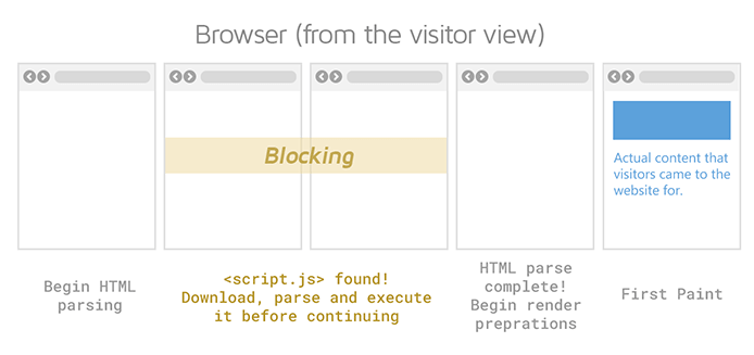
Once the stylesheets have been parsed and the scripts have been executed, the browser fixes the layout for your page elements and then paints the pixels onto the screen.
The Critical Rendering Path encompasses the entire sequence of steps from the first browser request to the final painting of pixels onto the screen. Shortening the Critical Rendering Path can result in faster-loading pages.
Click here to learn more about the Critical Rendering Path.
Critical Request
Any request made for a resource that is essential to page rendering is considered a critical request.
For example, a heading text or hero image. Both of these may be among the first things seen by your visitors and would be considered essential site content.
Requests that aren’t considered critical can usually be deferred or asynchronously loaded.
For example, an image that only becomes visible when the user scrolls down or a widget in your page’s footer. Both of these aren’t needed when your page initially loads and can be loaded after other essential resources have finished loading.
CSS
CSS stands for Cascading Style Sheets. While the HTML determines the structure of your webpage, CSS specifies your webpage’s style.
This is accomplished through one or more CSS files (also known as stylesheets) that define and specify rules related to your webpage’s styling such as page design, layouts, colours, fonts, etc. Separate stylesheets can also be used to style content for display in different devices and screen sizes (i.e., mobile, desktop, tablet, etc.).
CSS can be external, internal, or inline.
- External stylesheets can handle styling for your entire website and are usually added to your page’s HTML using link tags.
- Internal stylesheets comprise of CSS code written directly in your page’s HTML header.
- Inline CSS, on the other hand, includes CSS code that is directly embedded within your page’s HTML code. Inline CSS is usually used for individual styling changes.
CSSOM Tree
CSS Object Model (CSSOM) Tree represents your webpage’s styling. It is a programming interface similar to the Document Object Model (DOM) Tree.
While the DOM Tree pertains to your page’s HTML relationships, the CSSOM Tree contains information on each element’s styling.
As is the case with the DOM Tree, the CSSOM Tree contains nodes that represent your CSS and related properties. These nodes are connected to other nodes with parent-child relationships, sibling relationships, and so on.
The CSSOM Tree is constructed after the DOM Tree has been built. While the DOM Tree allows manipulation of your page content and HTML, the CSSOM Tree allows manipulation of your CSS using JavaScript.
Click here to learn more about the CSSOM Tree.
D
Document Object Model (DOM) Tree
The Document Object Model (DOM) Tree is the structural representation of a document (i.e., your webpage).
It is a programming interface that represents the nodes and objects that comprise the structure and content of your HTML webpage.
When the browser loads your page, it parses through the HTML and builds the DOM Tree. This can then be modified by JavaScript to manipulate the webpage’s structure, style, and content in order to render your page.
The tree contains nodes that are a representation of your page’s HTML elements. These are linked with other nodes, and the DOM Tree establishes the relationship between them, such as parent-child relationships, sibling relationships, etc.
Click here to learn more about the DOM Tree.
Dedicated Hosting
Dedicated hosting is a website hosting solution where you are the only user on the server, giving you full control over your server configuration. In other words, you don’t have to share your server’s CPU/memory resources with other websites.
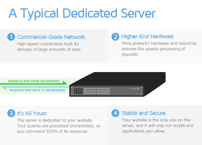
This type of hosting solution is usually preferred by Enterprise level sites as it is often the most expensive service available, but also offers the highest performance levels for websites.
Defer
Deferring refers to the practice of delaying the loading of certain page resources like scripts, stylesheets, and images that aren’t needed during the initial page load.
Usually, the browser loads resources in the order that they were retrieved from the server. When the browser encounters scripts and stylesheets, it needs to pause all other tasks and focus on loading these resources. This blocks the initial rendering of your page.
Depending on how long these resources take to execute, your page load times could end up being severely delayed.
It is considered an industry best-practice to defer the loading of non-critical resources i.e., resources that aren’t needed for initial page rendering.
DNS
DNS stands for Domain Name System. DNS is a hierarchical and decentralized naming system for internet resources. In other words, it maintains a directory of domain names along with their associated resources (like IP addresses).
Think of DNS as the internet’s phonebook. When you type a website’s human-readable domain name into the browser’s address bar (e.g., gtmetrix.com), the DNS server translates it into a unique IP address (e.g., 204.187.14.69). This IP address is used by browsers to find internet resources.

You can also access the domain by entering the IP address directly into the browser’s address bar. DNS servers eliminate the need for humans to memorize each website’s IP address.
The process of mapping or converting a human-friendly domain name to the appropriate machine-friendly IP address is known as DNS Lookup or DNS Resolution.
The time taken to accomplish this is known as DNS Lookup time, which is represented by the teal coloured request timing bar on the Waterfall chart.
E
Event listener/Event handler
An event is some action that happens in the system you are designing or programming. For example, a user clicking a button on your webpage.
An event listener/event handler is a piece of code used to deal with this event when it occurs. In the above example, event listeners/event handlers can be used to handle the user input by changing a background colour when the button is clicked. In most cases, JavaScript is used to execute this type of functionality.
Note that event listeners and event handlers are sometimes used interchangeably. However, in the strictest sense, an event listener is used to listen for the event that is happening, and an event handler is used to respond to that user input.
It is possible to add more than one event handler to the same element, without overwriting existing events.
ES5
ES5 stands for ECMAScript 5, which is the 5th edition of the ECMASCRIPT programming language. It is a JavaScript standard created to ensure webpage interoperability across different browsers.
ES5 is commonly used for scripting on, both, the client-side and the server-side, adding more features and functionality compared to the previous editions.
ES5 enjoys near-universal support across different browsers. Consequently, it is favoured by many developers over the latest (and possibly more advanced) ES6 standard.
ES6 (or ES2015+)
ES6 stands for ECMAScript 6, which is the 6th edition of the ECMASCRIPT programming language. It is also known as ES2015 and is a JavaScript standard that adds new syntax for writing more complex applications.
ES6 builds on the ES5 standard, adding more advanced JavaScript functionality to webpages and web applications. It has been known to improve web performance through the use of clearer and more concise code that can reduce the JavaScript payload delivered over the network.
There have also been further revisions to ES6 post 2015, with each successive version being named according to the revision year (i.e. ES2016, ES2017, etc.).
While most modern browsers support ES6, it doesn’t have the same levels of support as the ES5 standard. Consequently, many developers continue to ship ES5 code.
Execution
Execution refers to the process that takes place after parsing for JavaScript files. When a script is executed in a JavaScript run-time environment, the parsed code is used to create an ecosystem that supports the various aspects of script functionality (e.g., arrays, functions, variables, etc.).
Basically, parsing is the process of extracting structural information from the code while execution is the actual processing of that code to create the required functionality. This could involve reading and writing files, invoking functions, setting event handlers, etc.
Note that script execution is usually synchronous i.e., it executes code line-by-line (unless explicitly deferred). Scripts are also executed on the main-thread, by default.
F
Favicon
A favicon (i.e., favourite icon) is a tiny icon included along with a website. It is also known as shortcut icon, website icon, tab icon, URL icon, or bookmark icon.
It is usually 16 x 16 pixels in size and found next to any mention or identification of your website (e.g., page tabs, bookmarks menu, history results, etc.). It may be stored as a GIF, PNG, or ICO file.
A favicon is something that instills familiarity with your website and is generally used for the purposes of branding and improving user experience. When users see your favicon, it immediately helps them identify your website and lets them know that they’re in the right place. It also helps them to easily find your website when they have multiple tabs open in their browser.
Most favicons tend to be the same as the brand logos for that particular website.
G
GIF
GIF stands for Graphics Interface Format and is an image format that uses lossless compression. While GIFs can be used to serve still images, they are more commonly used for animations as they can hold multiple pictures at once that can be sequentially loaded.
GZIP
GZIP is a popular lossless compression algorithm used to compress text-based resources (i.e., HTML, CSS, and JavaScript).
GZIP is one of the best compression algorithms available and enjoys wider browser support than other compression algorithms, like Brotli.
While brotli can provide higher compression ratios than GZIP, GZIP is faster at compressing data in the first place.
H
HTML
HTML stands for Hypertext Markup Language. It is a descriptive language used to create webpages.
HTML contains a series of elements (e.g., heading, paragraph, bullet list, etc.) that describe the structure of your webpage and tells the browser how to display the content.
Click here to learn more about HTML.
HTTP/1.1
HTTP stands for Hypertext Transfer Protocol and is the application-level protocol used for data and information transfer (e.g., requests, resources) over the internet.
HTTP/1.1 refers to the particular standard introduced in 1995, and was an update on the HTTP/1 specification. Since 2015, however, many websites have switched over to HTTP/2, which is the updated HTTP standard.
HTTP/2
HTTP/2 is the revised HTTP standard, and represents a major upgrade to HTTP/1.1. HTTP/2 offers many performance benefits compared to HTTP/1.1, like lower latency, higher connection limit to handle parallel requests, and lower protocol overhead.
In general, HTTP/2 allows more efficient handling of pages with a large number of requests compared to HTTP/1.1, allowing for faster loading pages.
J
Jank
Jank refers to any form of stuttering, halting or visual instability while your page is rendering content on the screen. Jank can happen during transitions, animation, or scrolling, resulting in users perceiving your site to be choppy or unreliable when they use it.
Jank usually happens because the webpage’s frame rate can’t keep up with the refresh rate of the user’s display. Most devices refresh the display 60 times per second (i.e., refresh rate = 60 Hz). When there is motion on the screen, the browser usually matches this refresh rate by creating 60 frames per second (i.e., frame rate = 60 Hz).
This motion is usually controlled by CSS or JavaScript, and if the browser’s main-thread is kept busy for too long, the browser execution time increases, resulting in missed frames and the visual stuttering that users experience (i.e., page jank).
Page jank is usually caused by JavaScript taking too long to run, or the browser requiring style recalculations and layout changes.
JavaScript
JavaScript is a programming language that was created to implement complex and interactive website features and manage dynamic website content. Anything that moves, changes, or updates on the screen without the need to refresh or reload the page is usually implemented using JavaScript.
Examples of JavaScript functionality include animated graphics, image slideshows, autocomplete text suggestions, interactive forms, timely news updates, etc.
The JavaScript programs are called scripts, which can be executed as plain text within the page’s HTML. JavaScript can be executed on any device that has a JavaScript engine, like a web browser or a server.
JavaScript is integral to website functionality, and is directly related to your website performance. Click here to learn more about JavaScript.
JPEG
JPEG stands for Joint Photographic Experts Group. It is a lossy compression format used for digital images.
JPEG is the most widely used image format in the world, with the widest support among browsers and devices. JPEG allows you to adjust the compression ratio as needed, to reach an acceptable trade-off between size and image quality.
JPEG is best used for still images, photos, images and graphics with complex colours and light/dark shades. JPEG is less suitable for monochrome and line-based graphics as they don’t support transparency.
JSON
JSON stands for JavaScript Object Notation. JSON is a data-interchange format used for storing and transporting data.
JSON is often used to transport data from server to a webpage and can be used to represent numbers, booleans, strings, arrays, and objects, etc.
The JSON syntax is identical to the syntax used to create JavaScript objects, allowing easy conversion of JSON data into JavaScript objects.
Click here to learn more about JSON.
L
Lazy loading
Lazy loading refers to the practice of delaying the loading of resources (usually, images) until they are needed by users.
When implemented correctly, they allow fast loading of webpages and facilitate a smoother user experience.
For example, images that aren’t visible in the user’s viewport can be lazy loaded so that they appear into view as the user scrolls down to see the rest of the page.
CSS and JavaScript files can also be deferred in this manner, in combination, with code-splitting so that critical code is preloaded and non-critical code is lazy loaded to improve web performance.
Latency
Latency refers to the time taken for a packet of data (e.g., for a requested resource) to be sent over the network. It is used to express how much delay is experienced over the network.
A network with low latency will ensure swift transfer of resources from the server to the client (i.e., browser).
A network with high latency will suffer from delays in transferring the resources to the client.
Legacy Reports
Legacy Reports in GTmetrix refer to reports that are generated using the old PageSpeed/YSlow libraries.
Link Tags
Link tags are HTML elements that are used to define relationships between the current document (i.e., your webpage) and external resources.
Link tags are placed in the HTML header and are commonly used to link or import external stylesheets to your webpage’s HTML.
For example,
<link rel="stylesheet" type="text/css" media="handheld" href="mobile.css">
In the above example,
- the rel attribute tells the browser that the referenced document is a stylesheet.
- the type attribute tells the browser that the file is a .css file.
- the media attribute specifies that this stylesheet should be displayed on a handheld device.
- the href attribute specifies the name of the .css file being referenced.
Link tags are also used to perform other tasks such as preloading key requests, preconnecting to important third-party domains, etc.
Long task
A long task is typically associated with the main-thread and refers to any task that runs for longer than 50 ms.

Long tasks cause the browser to block other essential tasks related to the page load process and can delay initial rendering of content on your page.
M
Main-thread
When a webpage starts loading (or a web application starts running), the system starts a new process to execute different events related to the application. By default, all the components run on the same process or “thread”, and this is referred to as the “main-thread”.
The main-thread is where the browser processes most of the tasks related to your page load, like rendering/painting content or handling user interaction.
Some of the browser tasks executed on the main-thread include, among others:
- Handling layouts
- Parsing CSS and HTML
- Building the Document Object Model (DOM)
- Executing all the JavaScript (by default)
Minification
Minification refers to the process of removing unnecessary or redundant data without affecting the way a resource is processed by the browser.
It is an optimization technique and usually entails the removal of comments, white spaces, and redundant code from text-based resources (i.e., HTML, CSS, and JavaScript).
P
Page Builder
A page builder is any plugin or theme functionality that allows you to easily structure your page’s layout.
They are commonly used with Self-hosted CMS platforms (WordPress, Magento, Drupal, etc.) and provide drag and drop functionality for adding components to your page, like images, videos, text blocks, buttons, animations, etc.
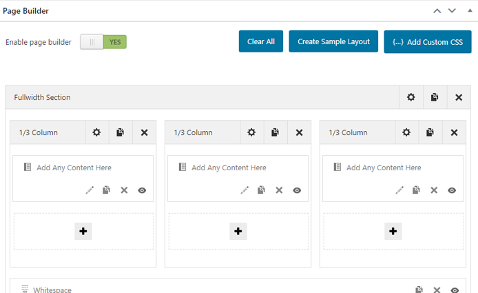
The biggest advantage of using a page builder is that you don’t need to be an experienced developer or have any coding knowledge to build and customize your page.
The interface does everything for you at the back-end while providing a front-end preview so that you can see how your page looks and feels.
However, a major disadvantage of using a page builder is that they often add heavy overhead in terms of code and complexity to your page, depending on the level of page customization desired.
Learn more about the pros and cons of using a page builder here.
Parsing
Parsing a document (HTML/CSS/JavaScript) refers to the process in which the code is read and analyzed line-by-line, then tokenized. Basically, it is used to uncover syntax errors, as well as, extract relevant information related to the document being parsed, then converted into a format that can be used by the system’s internal runtime engine (e.g., browser engine, JavaScript engine).
For example, when the browser parses your webpage’s HTML, it extracts information like the the page title, different paragraphs, text headings, links, etc. and uses that information to build the DOM Tree.
Similarly, parsing the CSS is used to extract information related to your page styling like background colours, text colours, fonts, positioning of images, etc. and build the CSSOM Tree.
Note that non render-blocking resources (e.g., images) will not interrupt your browser when it parses your page’s HTML. However, render-blocking resources (e.g., CSS, JavaScript) will cause the browser to stop the parsing process and focus on processing those resources instead.
By default, JavaScript is always render-blocking as it will cause the browser to pause HTML parsing and focus on loading the script instead.
Payload
Payload refers to the amount of data transmitted over the network from the server to the client (i.e., browser). Your network payload depends on the size of your page resources sent by the server.
A lower network payload can result in faster loading pages, improving your visitors’ page experience. Reducing the network payload can also help reduce overall bandwidth consumption, lowering internet and data costs for mobile users.
PNG
PNG stands for Portable Network Graphics. It is an image and graphics file format that supports lossless data compression.
PNG is best used for images that need to maintain their original quality, like graphics, logos, charts, and infographics.
Note that since PNGs are typically larger file sizes than JPEGs and GIFs, it is recommended that you serve optimized images that are as small as possible for the intended application.
R
Raster Image
A raster image is an image format that is represented as a grid made up of numerous individual pixels, e.g., photographs.
The more pixels the image has, the higher resolution/quality/file size it is. Common raster formats on the web are JPEG, PNG, and GIF.
Real User Monitoring (RUM)
Real User Monitoring (RUM) is a form of passive monitoring that measures the performance of a webpage from real users’ devices as opposed to synthetic monitoring that specifically launches tests against set criteria.
An example of RUM is Google’s Chrome User Experience Report (CrUX), which collects user experience metrics for how real-world Chrome users experience popular websites. Click here to learn more about CrUX.
Redirect
A URL redirect maintains continuity between an old, potentially broken URL and another active URL. When a user attempts to access the old link, they are automatically ‘redirected’ to the new link ensuring a smooth transition.
This happens behind the scenes, and enables developers to avoid scouring through all possible mentions of the old link on the internet in order to change them to the new link.
Common use cases for URL redirects include website migration, https encryption, canonicalization (i.e. redirecting from www to non-www or vice versa), geolocation, platform-specificity, or combinations of the above.
Depending on how they are set up, redirects are broadly classified into Server-side and Client-side redirects.
In the interest of web performance, avoid redirects, if you can; when this is not possible, try to minimize them as much as possible.
Render Tree
The Render Tree is the result of the combination of the DOM and the CSSOM Trees.
The DOM Tree contains all the information about the structure of the page’s HTML elements, and the CSSOM Tree contains information pertaining to how the elements are styled.
When combined, the Render Tree contains the entire information about all the visible DOM content on the page, as well as, all the CSSOM information related to styling of the various nodes.
The construction of the Render Tree enables the browser to start establishing your page’s layout so that your page can be rendered. The information in the Render Tree enables the browser engine to calculate styling and geometry for each element, following which, the pixels are painted onto the screen.
Request header
A request header is an HTTP header sent by the browser, along with the HTTP request.
The request header lets the browser pass information related to the HTTP request, such as what the browser wants, what file formats are accepted by the browser, what type of compression is accepted by the browser, etc.
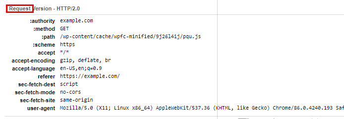
The request header also contains information related to the version, type, and capabilities of the browser making the request so that the server can send compatible data.
Response header
A response header is an HTTP header sent by the server, along with a page resource.
The response header lets the server pass information to the browser that is related to the resource being sent, such as the resource’s file type, resource’s file size, which server/CDN was used to serve the resource, etc.
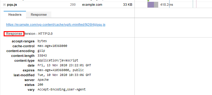
The response header also contains more information related to the server that sent the resource, as well as, additional details like how long the resource can be cached for, when the resource was last updated, etc.
Responsive Design
Responsive design is a website design practice, in which, the layout of the website varies according to the screen width of the device used to access that website.
It can be considered a “one-size-fits-all” solution as it is generally used to design one version of a website (e.g., for mobile) and then scale it based on the device used to access the website.
Moreover, many CMSes and website builders (e.g., WordPress, Magento, Shopify, etc.) provide themes, plugins, and other tools to enable users to create websites that utilize responsive design.
Responsive design, when done properly, results in the website layout smoothly adjusting to the browser width, no matter what device is used.
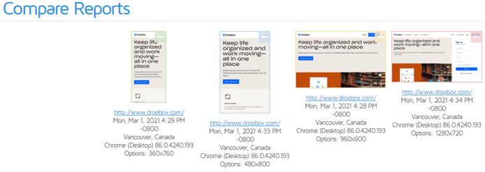
Responsive design is similar to Adaptive design in that the website’s layout (and subsequently page assets) changes based on the viewport; however, where this design philosophy differs is that it modifies the existing layout depending on the user’s viewport.
Read more about Responsive design and its differences with Adaptive design here.
Round-Trip-Time (RTT)
Round-Trip-Time (RTT) is defined as the time taken for a data packet to be sent to a destination, plus the time it takes for that packet’s acknowledgement to be received at the origin.
Within the context of web performance, it is the time taken from the moment an HTTP request is sent by the client (i.e., browser) to the server plus the time taken by the server to return a 200 OK status response.
A high RTT usually indicates slow server response, or multiple redirects that could cause delays in your page loading time.
S
Secure Socket Layer (SSL)
Secure Socket Layer (SSL) is an encryption-based internet security protocol to keep the internet connection secure between networked devices.
It was created to enforce privacy, authentication, and data security so that attackers couldn’t read, modify, or steal the data and information being transferred between devices. The devices could be a server and a client or two different servers.
SSL works by encrypting (i.e., scrambling) the data being sent between users and your site to prevent hackers from reading it while the data is in transit. This information could be sensitive or personal information like your users’ personal details, financial information, login/authentication details, etc.
SSL encryption is implemented through the use of digital documents known as SSL certificates, which are installed on your server. Each certificate has a key pair – a private key and a public key, which act together to provide encryption. Each certificate also contains the identity of the website owner.
When your site is protected by SSL encryption, your domain name starts with https:// instead of http:// and a padlock is seen on the browser’s address bar next to your URL. Clicking the padlock reveals information related to the SSL certificate issued for that website.
Click here to learn more about SSL.
Shared Hosting
Shared hosting is a website hosting solution where multiple websites are hosted on the same server. That means all of the websites hosted on that particular server share the available CPU/memory resources.
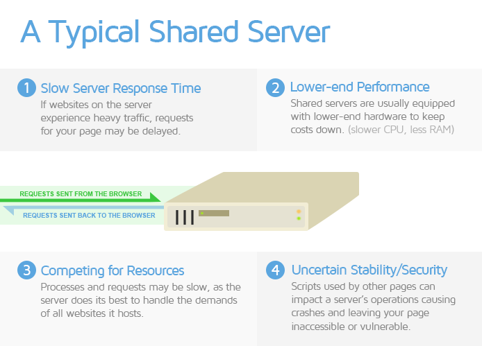
This type of hosting solution is usually the most economical service available, and is fine for small and/or simple websites with not much traffic. However, if your website is complex and/or experiences higher traffic, its performance will be noticeably affected.
Speculative Parsing
To understand speculative parsing, we have to revisit how the browser loads your page.
Normally, when your page starts loading, the browser parses your page’s HTML to build the DOM Tree. This is essential for the page loading process as any delays in building the DOM Tree (e.g., JavaScript blocking the main-thread) will consequently delay the rendering of your page content. Once the DOM Tree has been built, the browser builds the CSSOM Tree and combines them to construct the Render Tree.
However, the DOM Tree is built bit-by-bit as the browser has to sequentially parse through each line of your HTML code. When a script is encountered, HTML parsing has to be paused because scripts can manipulate the DOM Tree.
If the browser paused the HTML parsing process every time it encountered a script, the browser would be significantly delayed in discovering the rest of the resources that are slated to be loaded. This delay may, in turn, cause delays in DOM Tree construction, creating a bottleneck in the page loading process, and ultimately resulting in a slow loading page.
Speculative parsing is a feature found in many modern browsers to partially overcome the above limitation. In this case, the browser starts looking ahead to load scripts, stylesheets and images it finds in the parsing stream.
This allows the DOM Tree to continue being built through predictive runs, in the interest of page load performance.
If the speculation is successful, the browser need not re-parse the portion of your page’s HTML that was already scanned for scripts, stylesheets, and images. However, if the speculation fails, there’s more work lost because the browser has to parse the HTML for those resources again.
Note that using document.write() to inject scripts is known to cause failures in speculative parsing, and you should avoid doing so to prevent significant delays in DOM Tree construction.
T
TCP /TCP Connection
TCP stands for Transmission Control Protocol, which is a connection standard that specifies how different applications exchange information with each other. TCP, along with the Internet Protocol (IP), define how devices send data packets over the internet.
TCP is in charge of establishing and maintaining the connection until the application programs have finished exchanging information. This includes everything from the initial opening of the connection to how the application data is broken into packets for delivery, and further steps, all the way up to the final acknowledgement received upon successful data transmission.
When the browser wants to fetch a resource from your server, it opens a TCP connection to send the HTTP request.
Click here to learn more about TCP.
Transport Layer Security (TLS)
Transport Layer Security (TLS) is basically an updated and more secure version of Secure Socket Layer (SSL).
Click here to learn more about TLS.
Tree Shaking
Tree Shaking is a term associated with JavaScript, and is used within the context of dead-code elimination. It relies on the structure of ES2015 JavaScript module syntax, and is a method of finding and removing unused, unwanted, or duplicate code from JavaScript modules.
Click here to learn more about tree shaking.
U
Uniform Resource Locator (URL)
URL stands for Uniform Resource Locator. A URL is basically a web address that points to a web resource (e.g., image, CSS file, etc.) or document’s (e.g., webpage) location.
It incorporates the domain name, along with other important information to create a unique web address so that you can find specific webpages or resources.
For example, https://gtmetrix.com/blog is the URL for the blog section on our website.
A URL is helpful as it is human-readable and you don’t need to memorize IP addresses to find resources or webpages.
Think of a specific webpage as a house that you need to find on the street (in this analogy, the website). The URL is the navigation route/path you must take to locate the house.
User-Agent
The User-Agent is an identifier that represents a user (e.g., a browser, device, etc.), within the context of the internet and/or web performance.
The user-agent is a characteristic string in the HTTP request header that helps webservers and other network devices identify the application, operating system, vendor, and/or, version of the user-agent making the specific request.
For example,
user-agent: Mozilla/5.0 (X11; Linux x86_64) AppleWebKit/537.36 (KTHML, like Gecko) Chrome/142.0.0.0 Safari/537.36
User Experience
User experience (also known as page experience) is a holistic concept that encompasses every aspect related to how a potential user (i.e., one who visits and uses your website) perceives your website’s performance.
In a nutshell, it takes into account how fast your website loads, how quickly a user can use it, and how delightful the experience is.
V
Vector Image
A vector image is an image format composed by having the renderer follow algorithms that define lines, curves, shapes, and colours to generate the image, e.g., logos.
Because there are no pixels to work with, vector images are much smaller in file size compared to their raster counterparts.
They can also be scaled to whatever size is needed without sacrificing quality due to their algorithmic nature. The common vector format on the web is SVG.
Viewport
Viewport refers to the user’s visible area of a webpage. The size of the viewport varies based on the device used to access the webpage (e.g., desktop, a mobile phone, a tablet, etc.).

Your webpage will need to be appropriately sized and scaled depending on the devices used by your page visitors.
Virtual Machine (VM) or Virtual Private Server (VPS)
Virtual Machines (VMs) are a generic term for cloud-based servers created “virtually” from a high-performance physical server (called a “Host Server”). They may also be known as Virtual Private Servers (VPS) within the context of a hosting solution from hosting providers.
CPU and memory resources from the Host Server are allocated to the VM, based on the level of service you subscribe to.

Some VM examples include:
- AWS EC2 instances
- Google Cloud Compute Engine services
- Microsoft Azure Virtual Machines
- Digital Ocean Droplets
In web hosting, VPS hosting uses VMs to combine the benefits of Shared hosting and Dedicated hosting solutions.
It is similar to Shared hosting, as your website is not the only one hosted on a given server. However, you tend to have a fixed allocation of CPU/memory resources, which aren’t shared with other websites.
The use of Virtual Machines means you can easily scale up your CPU/memory resources as your needs grow.
W
Waterfall Chart
The Waterfall Chart shows the request-by-request loading behaviour of your webpage. It displays every single resource requested by your page, like scripts, media files, third-party resources, etc.
With a Waterfall Chart, you can see what requests loaded and in which order. The duration and execution time of each request is also displayed, with colourful bars representing how long each one took to request, download, and/or execute.
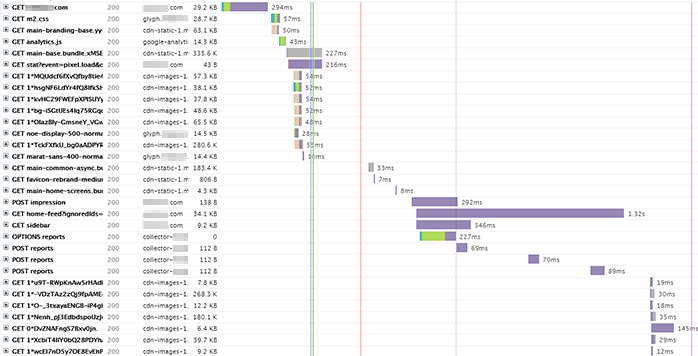
The Waterfall Chart aids you in debugging performance issues, as well as, general page issues as a whole. You will find the Waterfall Chart on a separate Waterfall Tab on the GTmetrix Report.
Click here to learn more about how to read a Waterfall Chart.
Web Server
A web server is a combination of hardware and software that uses various protocols (e.g., HTTP, TCP, etc.) to respond to client requests made over the internet.
In the context of hardware, a web server is a computer that hosts your website and stores its resources or component files, like HTML documents, images, stylesheets (CSS), JavaScript files, etc.
In the context of software, a web server contains several parts that process network requests and control how users access these hosted files.
When a user visits your website, the browser requests these files over the internet (i.e., HTTP requests). The web server hosting your website accepts the request, finds the requested files, and sends them so that the browser can display content on your website.
Each response from the server is accompanied by a 3 digit code indicating the status of that request (i.e., a status code).
For example,
- 301 status code – indicates that the URL has moved permanently.
- 200 status code – indicates that the HTTP request is successful.
- 404 status code – indicates that the requested resource could not be found.
Click here for a full list of HTTP status codes.
Common web servers include Apache, NGINX, Microsoft IIS, among others. Click here to read more about web servers.
Website Builder
Website builders are platforms that allow you to build your own website from scratch without requiring much technical or coding knowledge.
They are generally catered towards beginners – particularly, individuals who want to get a website up-and-running without requiring a developer.
The platforms make it easy to add all kinds of content and a variety of features to your website like images, videos, text blocks, buttons, sliders, animations, e-commerce functionality, etc.
Note that they’re different from page builders, which are commonly associated with Self-hosted CMS and provide plugin/theme functionality to easily structure the layout of webpages.
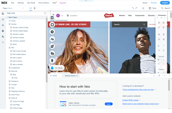
Here are some distinctions for website builders in general:
- Built on proprietary software (not open-source)
- You are limited in what you can configure or modify in terms of code.
- Certain audit fixes are not possible, as they require code modification outside of your control.
- Hosted on their own infrastructure
- This infrastructure is optimized for performance and delivery of the website builder software.
- Often, the infrastructure includes a Content Delivery Network (CDN).
- No access to servers
- You will likely not have control over any server configuration, settings, and options.
- Examples of Website builders include Shopify, Squarespace, Wix, and Weebly.
Check out our guide for providing a faster website builder-based experience.
WebM
WebM is an open-source, compressed multimedia format developed by Google for audio-video files. WebM was specifically developed for use with HTML5 for the purpose of serving videos on the web.
WebM is free to use for everyone – from developers, to website owners, to web users. This differentiates it from the MP4 video format, where licensing costs may be involved for the codecs used in MP4 videos.
WebM is also particularly suited to streaming videos on the internet (e.g., YouTube uses WebM videos), achieving a good balance of file size and video quality.
Even though the WebM format is not as widely supported as MP4, it is compatible with nearly all modern browsers.
Click here to learn more about WebM.
WebP
WebP is a next-generation image format employing, both, lossy and lossless compression. It is a sister format to WebM and is also developed by Google.
WebP can be used on a large variety of photographic, translucent, and graphical images on the web. The lossy compression ratio can be adjusted to achieve an acceptable trade-off between file size and image quality.
WebP images have been shown to be much smaller than equivalent PNG, JPEG and GIF images – by upto 25-50% in some cases. This makes them suitable for optimizing the performance of your websites.
Even though WebP is not as universal as JPEG images, it is supported by nearly all modern browsers.
Click here to learn more about WebP.


